Techies is an internal creative services team, and some changes were needed with structure. The team is made of 4 different service areas — Design, Video, Learning Development, and Technical Documentation. The growing team requires revamping of its site. Our stakeholder wanted to see three different UI design styles to choose from that would effectively display what the team is about.
ROLE
Visual and UX/UI designer
Visual and UX/UI designer
DATE
December 2024
December 2024

Overview
OBJECTIVE
Techies scaled quickly but the website wasn't converting enough audience due to confusion with its users. In this rebrand we aim to —
• Improve the visual language and UX of the team website
• Increase the conversion rate
Techies scaled quickly but the website wasn't converting enough audience due to confusion with its users. In this rebrand we aim to —
• Improve the visual language and UX of the team website
• Increase the conversion rate
TARGET AUDIENCE
Meta Infrastructure Data Center employees. This department has thousands of employees globally, the biggest department of the company.
Meta Infrastructure Data Center employees. This department has thousands of employees globally, the biggest department of the company.
KEY CHALLENGES
• simplify the UI design without omitting necessary content
• allow users to easily request a project
• showcase a portfolio for each service area
• simplify the UI design without omitting necessary content
• allow users to easily request a project
• showcase a portfolio for each service area
HOW IS IT SIMILAR TO THE OLD DESIGN?
Most content of the previous design are important information with some editing needed. It was a must that these sections are available to users.
Most content of the previous design are important information with some editing needed. It was a must that these sections are available to users.
HOW IS IT DIFFERENT?
The user interface of the old version was content heavy and was visually saturating. The new design aimed to simplify the page by separating each service area into its own page, rather than have everything on one page which created friction for some users.. Also, the old website did not have any emphasis on the project request access and have no samples available.
The user interface of the old version was content heavy and was visually saturating. The new design aimed to simplify the page by separating each service area into its own page, rather than have everything on one page which created friction for some users.. Also, the old website did not have any emphasis on the project request access and have no samples available.

Research and Discovery
PAIN POINTS
Understanding users is a very crucial part of the design. We conducted interviews and sent out survey forms to our users and have discovered a couple of interesting information. Majority of our users have reported their main pain points being —
Understanding users is a very crucial part of the design. We conducted interviews and sent out survey forms to our users and have discovered a couple of interesting information. Majority of our users have reported their main pain points being —
1. Getting the information as to what services are offered
2. Having an idea to different design styles for reference and inspiration
3. Accessibility to connect and request for a project
2. Having an idea to different design styles for reference and inspiration
3. Accessibility to connect and request for a project
REDEFINING THE OBJECTIVE
As we got to understand our users more to improve the services, we had to redefine our objective. "How to improve the agency's web UX that will include information about the type of services, portfolio/references, and accessibility to request a project?".
As we got to understand our users more to improve the services, we had to redefine our objective. "How to improve the agency's web UX that will include information about the type of services, portfolio/references, and accessibility to request a project?".

Ideation
A MODULAR APPROACH
We had to work on existing elements of the page, with that said, we had to breakdown these elements into modules, and brainstorm on how they can all be unified and improve the user experience. Below are the main modules —
We had to work on existing elements of the page, with that said, we had to breakdown these elements into modules, and brainstorm on how they can all be unified and improve the user experience. Below are the main modules —
• Homepage UI (revamped)
• Main nav bar
• Hero banner
• Service area page and services nav bar (new)
• Portfolio/sample projects (new)
• Main nav bar
• Hero banner
• Service area page and services nav bar (new)
• Portfolio/sample projects (new)
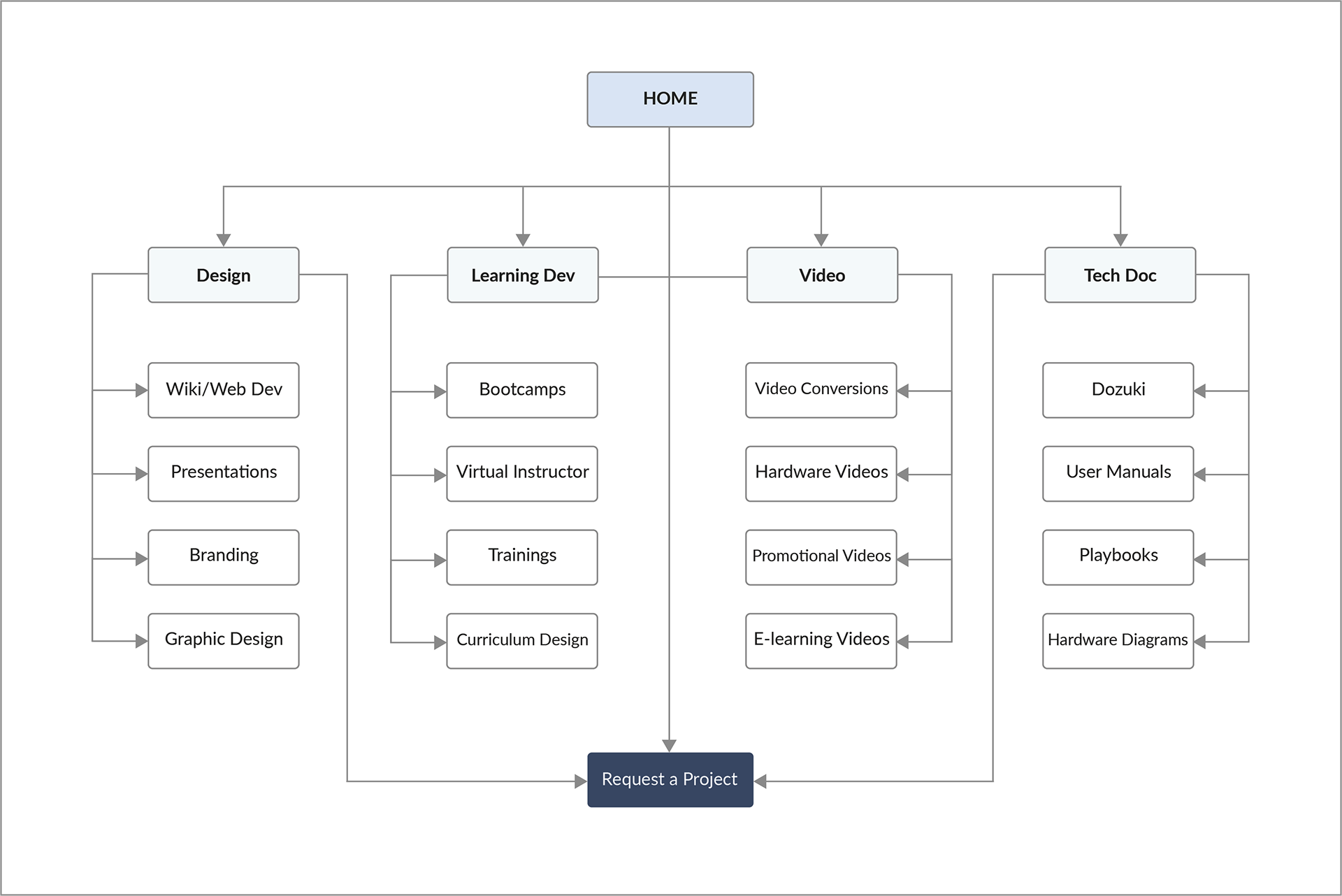
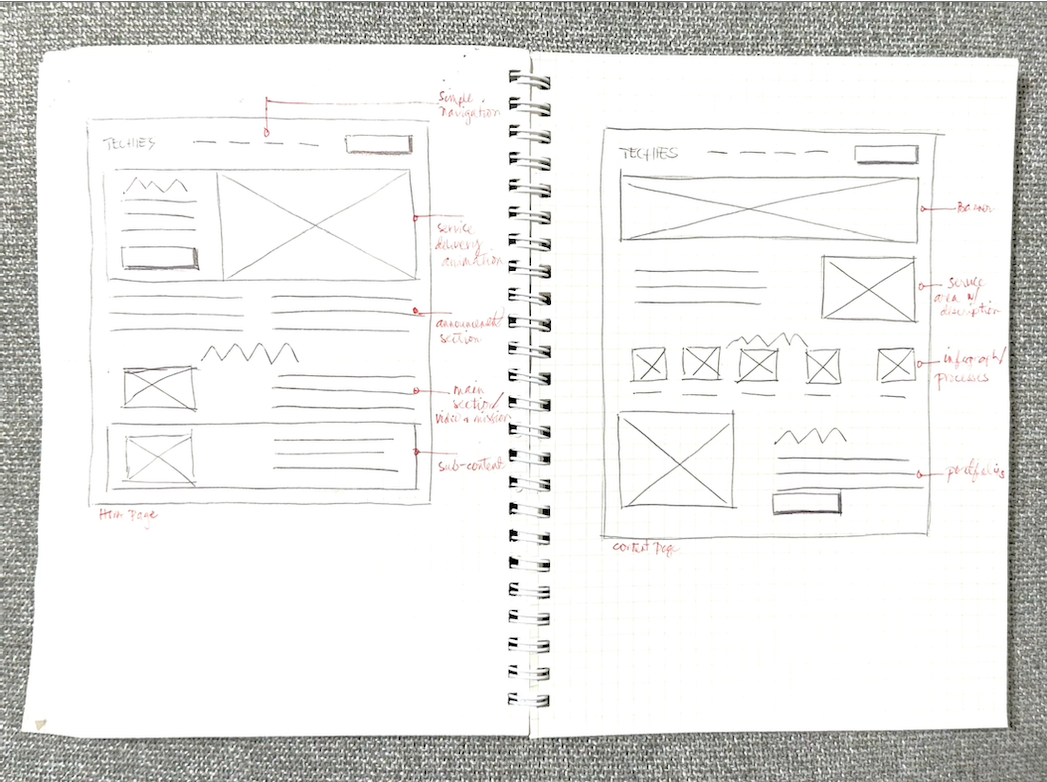
USER FLOW & WIREFRAMING
Before the presentation of the finished UIs for the stakeholders to choose from, I had wireframes for each options prepared. Talking to potential users, it was clear that most users who visited the website primarily wanted to request for a project, and secondarily, see design samples as reference, it was important to make this easy and accessible.
Before the presentation of the finished UIs for the stakeholders to choose from, I had wireframes for each options prepared. Talking to potential users, it was clear that most users who visited the website primarily wanted to request for a project, and secondarily, see design samples as reference, it was important to make this easy and accessible.
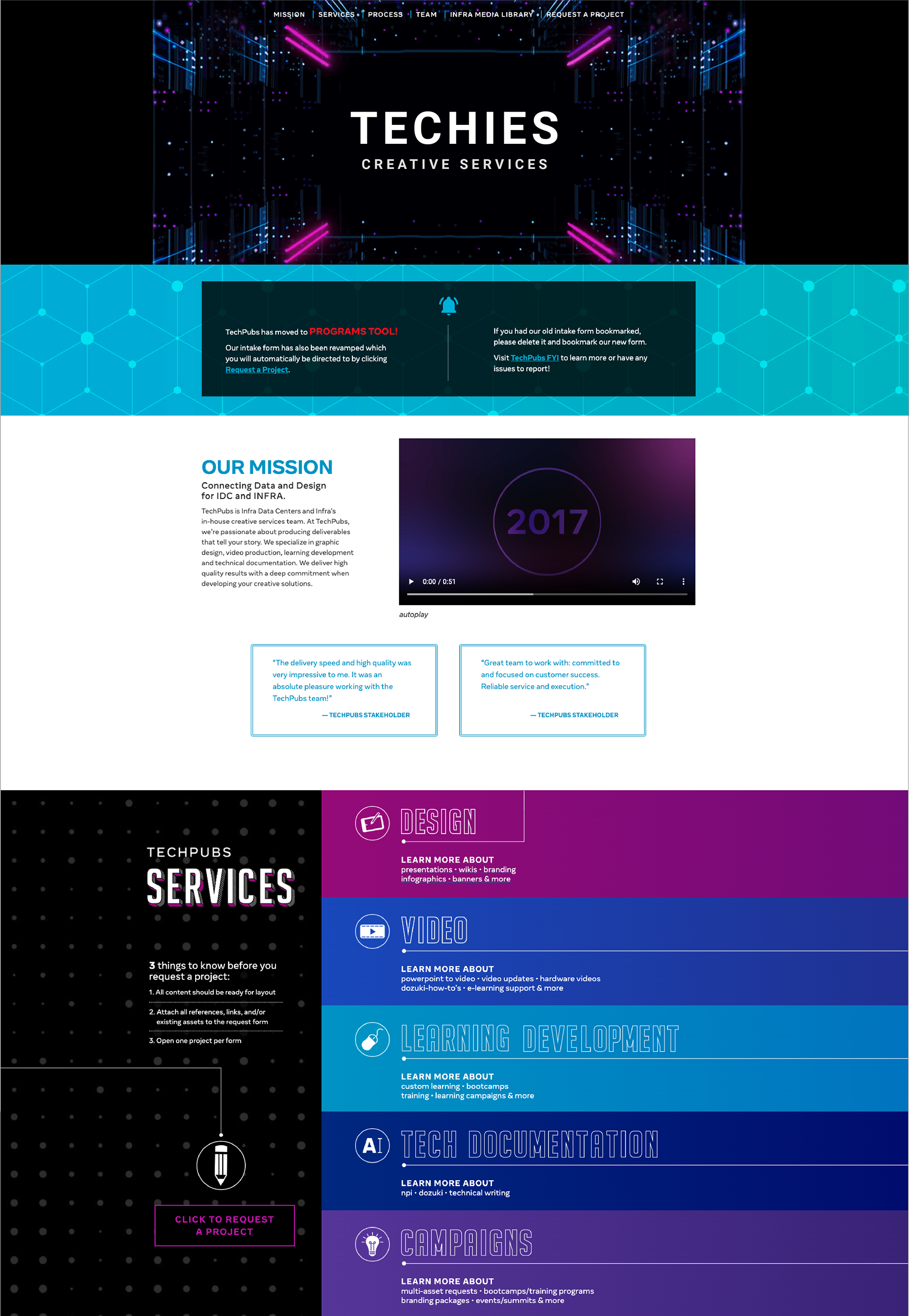
the old design
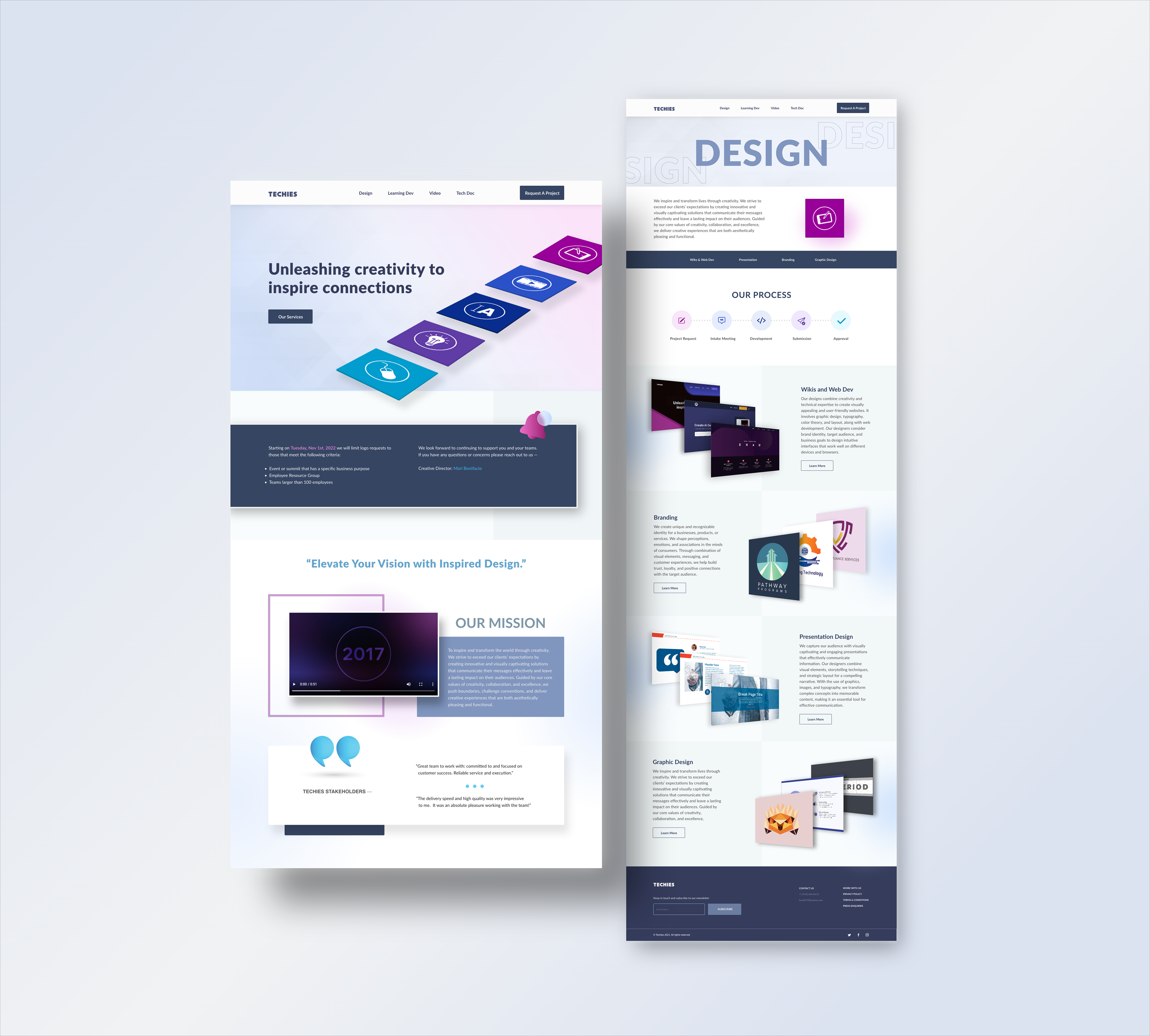
the new designs — options 1, 2, and 3
Above is the before and after of the web rebrand. The "Before" layout relied on a fragmented, saturated color palette with dense grids that obstructed user flow. In contrast, the "After" introduces an elegant, light-themed aesthetic with a clean typographic hierarchy, custom isometric icon styling, and generous whitespace.
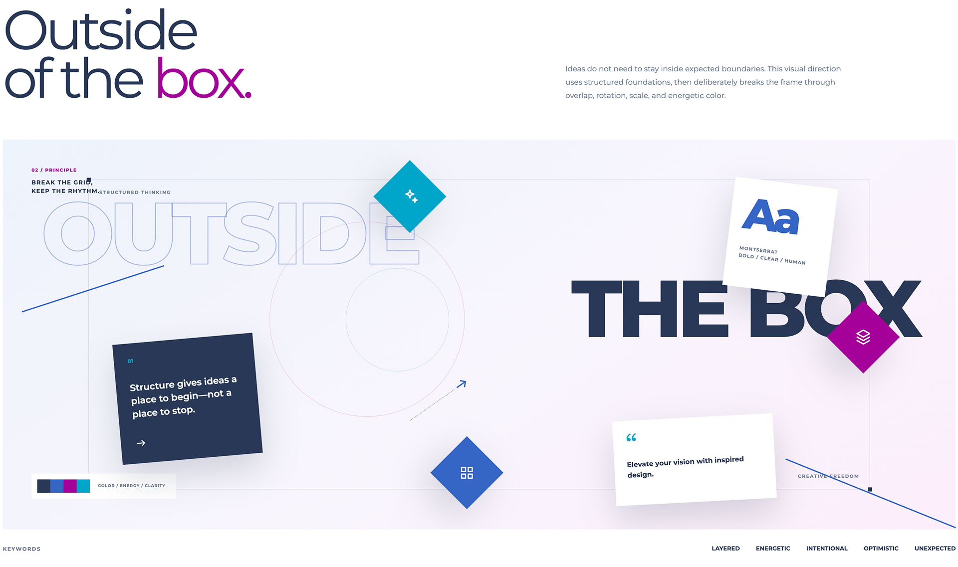
Mood Board: "Outside of the Box" is the concept for the rebrand being a creative services team; elements will be using overlapping visual elements, adding depth and layers to the design.
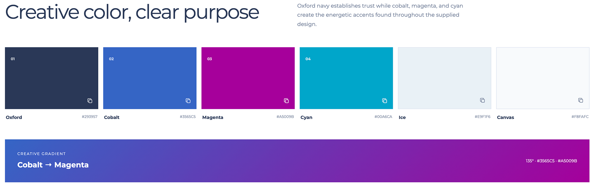
Color Palette: Our colors are primarily based on the theme of the previous design, but we want to be more strategic with how we use them as they are colors with high saturation and so on this iteration, these colors were used with more control as accents rather than backgrounds.

Typography: The typography of the new page will be very direct and straight forward, no use of any text effects to clearly convey the message but instead will use colors and scale for hierarchy.
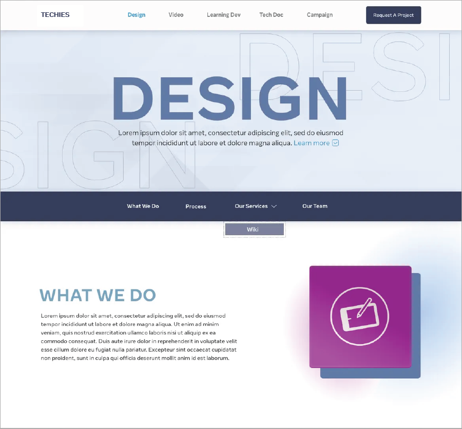
v.1 hero section
v.1 services section
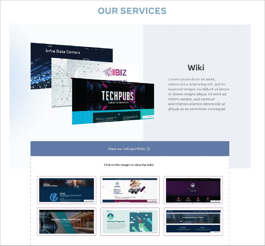
Sometimes along the way we don't always get it the first time. After creating this first version of the design, we tested it with some users and received some feedback. A good amount of our users were somewhat satisfied. Majority of this feedback were focused on the portfolio samples that we had to showcase not being as effective as we assumed. We knew that the design could use some iteration, and so we did buy reorganizing the service page navigation and the portfolio.
THE ITERATION
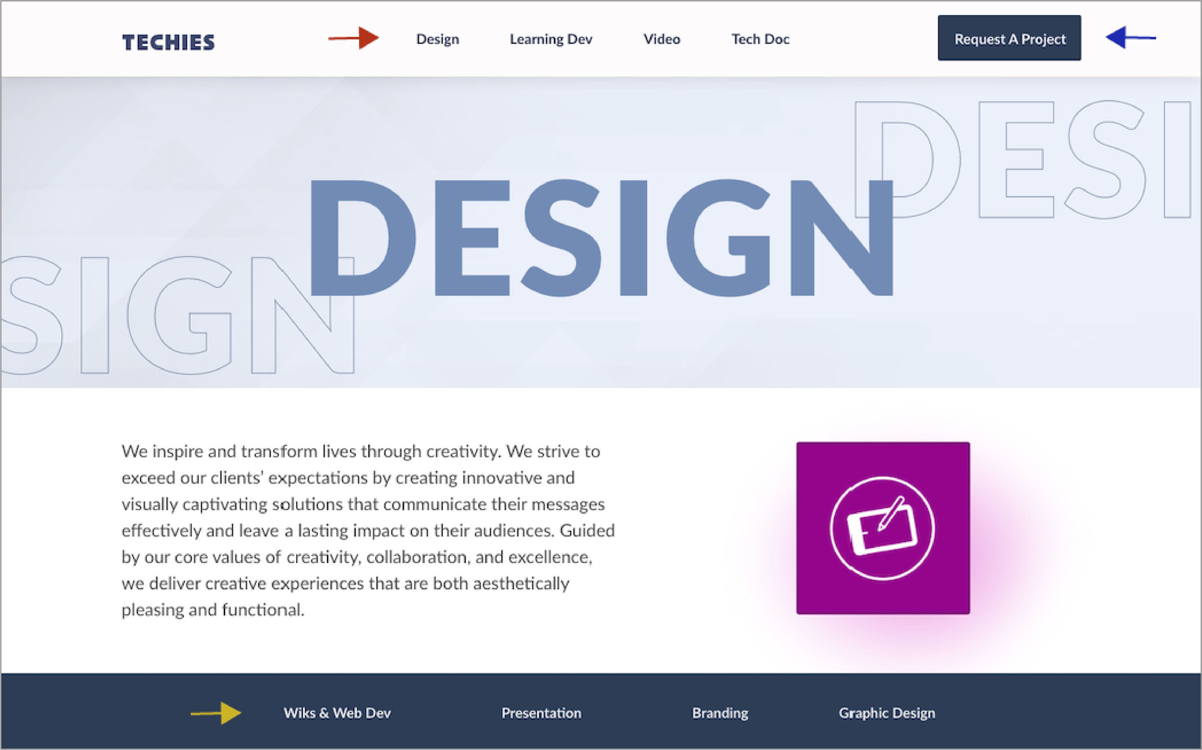
sample service area page
Red: Fixed main nav bar to separate all the service areas
Blue: CTA button for users/clients to conveniently request a project
Yellow: Second nav bar to minimize scrolling and locate sections of the services offered
Blue: CTA button for users/clients to conveniently request a project
Yellow: Second nav bar to minimize scrolling and locate sections of the services offered
SERVICE AREA PAGE AND SERVICES NAV BAR
This was a new element of the design. Each service area had their own page allowing them to allocate enough real estate for their personalized information, including a samples section. On each service area page, users still had access to request a project through the main nav bar and switch service areas page as needed. Separating all the service areas rather than having them all in one page (as seen on the old version) should organize the content for the entire team, improving navigation and engagement, and so the user experience.
This was a new element of the design. Each service area had their own page allowing them to allocate enough real estate for their personalized information, including a samples section. On each service area page, users still had access to request a project through the main nav bar and switch service areas page as needed. Separating all the service areas rather than having them all in one page (as seen on the old version) should organize the content for the entire team, improving navigation and engagement, and so the user experience.
A second nav was available on each service area page to help users find the type of services available. This nav bar will take them directly to the section of the specific service they were looking for. Having this nav bar will reduce scrolling time and improve the navigation as well.

PORTFOLIO/SAMPLES SECTION
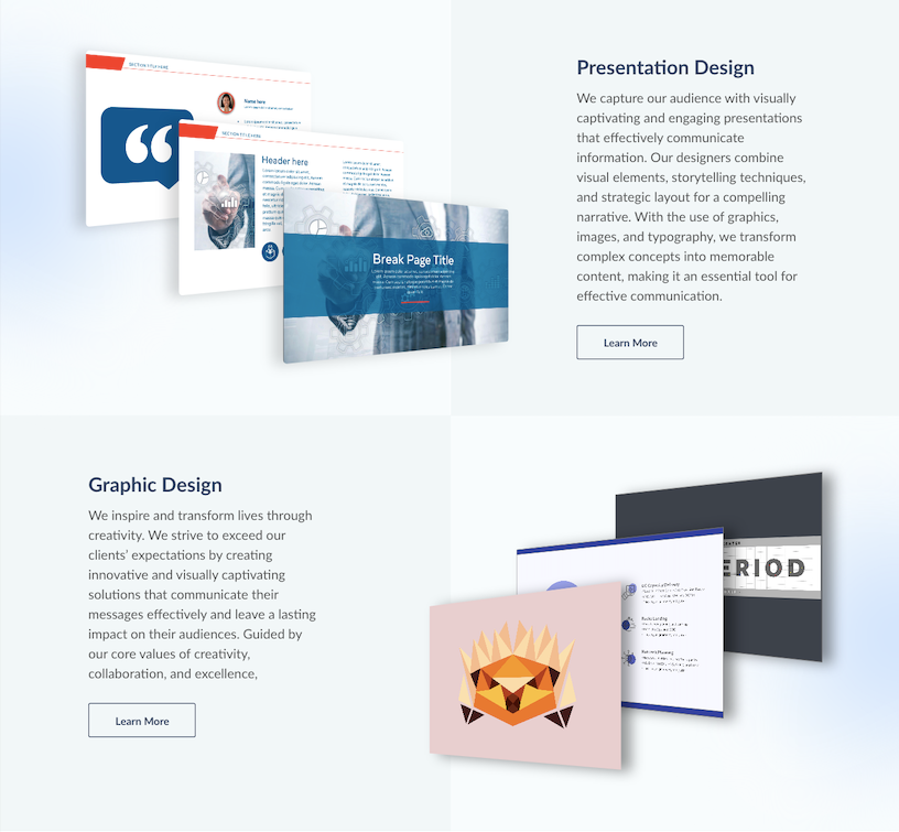
The service area page second nav bar are linked to these sections. These sections show a preview of the portfolio and other design samples. Clicking the CTA "learn more" are linked to an external page, where past works of the team are displayed. This allow users to have a better visual of the different services the team offers, and also learn about the process and requirements for requesting a project, solving one of the user pain points.
The service area page second nav bar are linked to these sections. These sections show a preview of the portfolio and other design samples. Clicking the CTA "learn more" are linked to an external page, where past works of the team are displayed. This allow users to have a better visual of the different services the team offers, and also learn about the process and requirements for requesting a project, solving one of the user pain points.

The Mock up
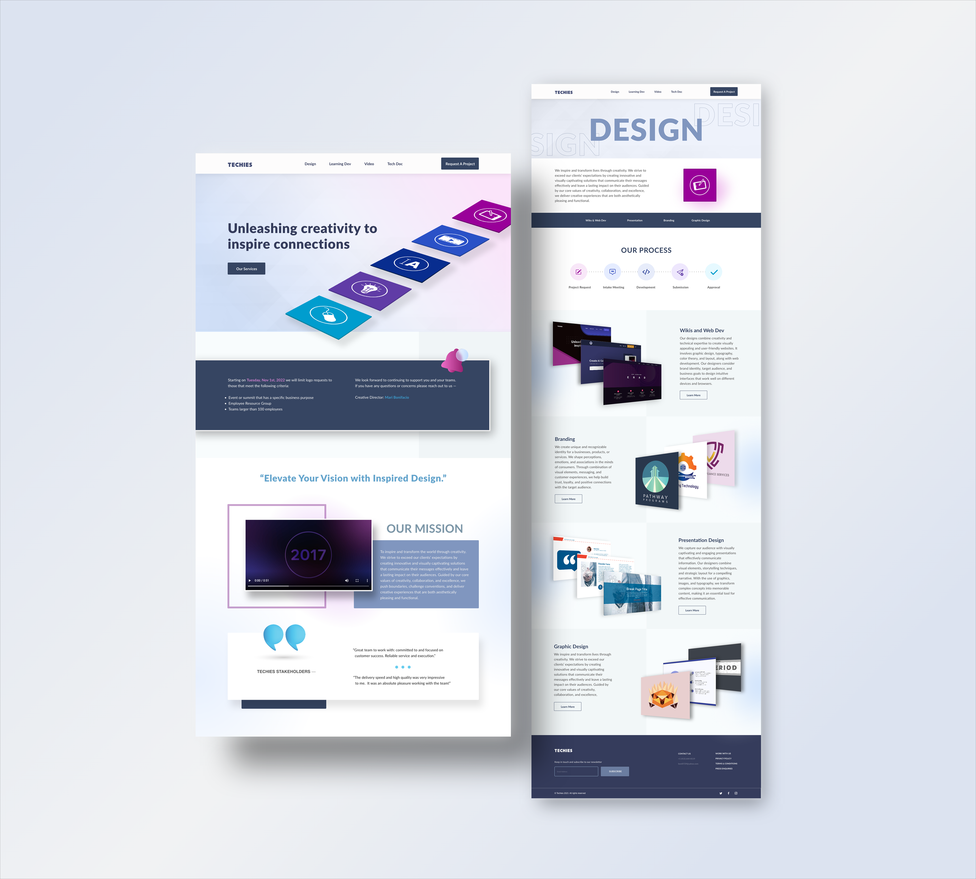
This strategic visual overhaul elevates the agency's professional authority, significantly balances content readability, and creates an intuitive, polished browsing experience through the web. The new design should improve navigation with the service areas having a dedicated page, allow users easy access to request a project, and also see design samples for reference providing better user experience.
CONVERSION INCREASE
The user-centric overhaul of Techies web landing page, drove a 6% increase in conversion rates. By simplifying navigation, strengthening the visual hierarchy, and creating clearer calls-to-action, we eliminated friction points in the user journey. This project successfully aligned modern aesthetic design that we can be proud of.
The user-centric overhaul of Techies web landing page, drove a 6% increase in conversion rates. By simplifying navigation, strengthening the visual hierarchy, and creating clearer calls-to-action, we eliminated friction points in the user journey. This project successfully aligned modern aesthetic design that we can be proud of.