
Video Infra is an internal team x Meta. They are responsible for video engineering within the company-wide products and infrastructure department. They were in need of a new site for their team and needed to organize their assets and create a resources page.
ROLE
web UX/UI designer, developer
web UX/UI designer, developer
DATE
September 2022
September 2022

Overview
OBJECTIVE
The goal of the project was to create the team's page. Organizing the given content, connecting users to department updates, and making sure users can effectively utilize the platform to help them use it as a resources page.
The goal of the project was to create the team's page. Organizing the given content, connecting users to department updates, and making sure users can effectively utilize the platform to help them use it as a resources page.
TARGET AUDIENCE
Meta Infrastructure Data Center — Video Infra employees. This department has hundreds of employees globally.
Meta Infrastructure Data Center — Video Infra employees. This department has hundreds of employees globally.
KEY CHALLENGES
• organize the content for each section
• create and include compelling graphics and images
• organize the content for each section
• create and include compelling graphics and images

Ideation
The stakeholders were clear with what they wanted. In terms of UI, they wanted a design that "stands out", and I thought instantly of a color I can work on. When I received the content, I read through it and immediately thought that the page will be short. I needed to work on a design that will be compelling even if there's not a lot content on the page.
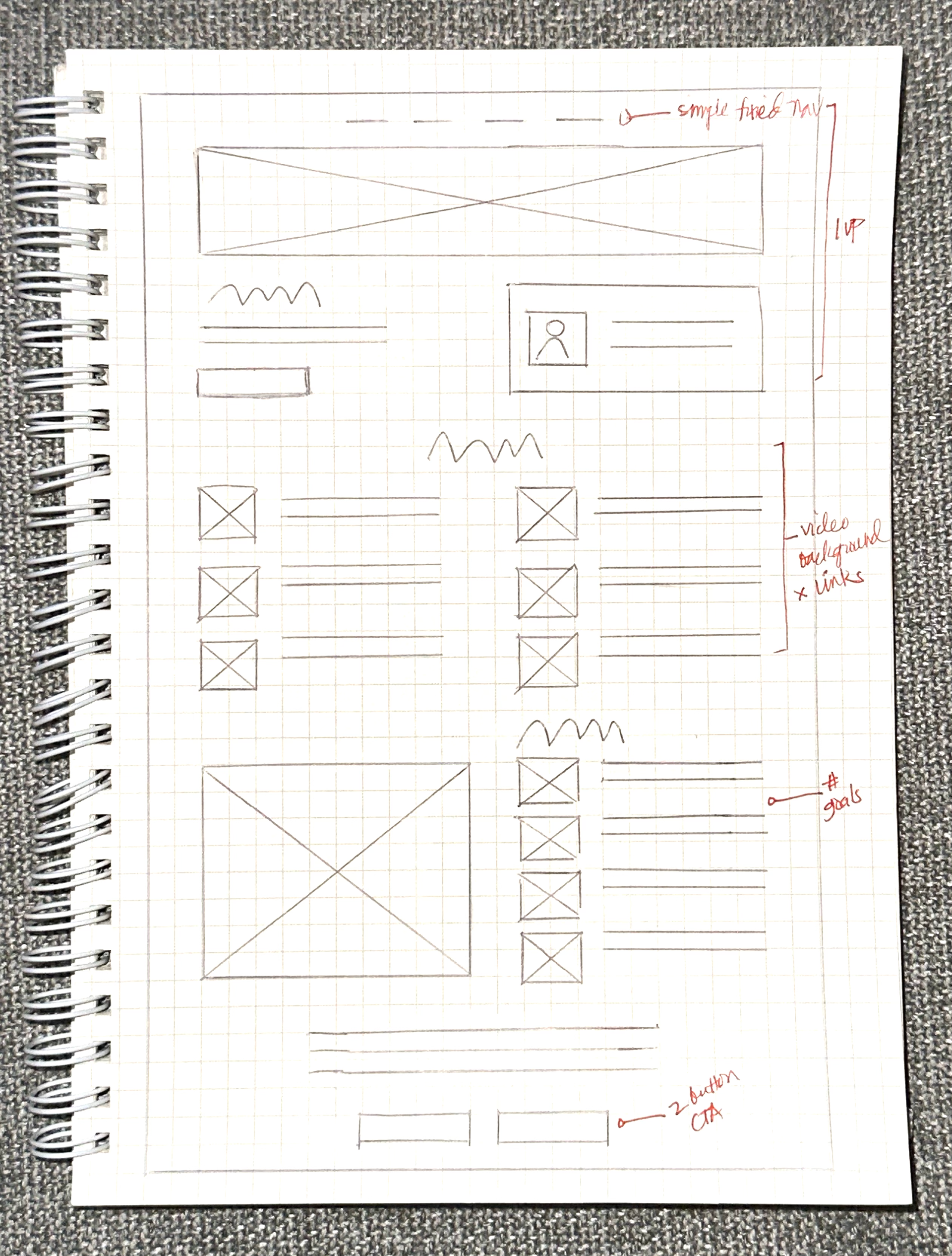

WIREFRAMING
I always start my design with an old-school sketch. I made a very simple and structured layout that involves highlighting some content that needed more priority, and/or adding graphics to them to create a visual reference of the subject.
I always start my design with an old-school sketch. I made a very simple and structured layout that involves highlighting some content that needed more priority, and/or adding graphics to them to create a visual reference of the subject.
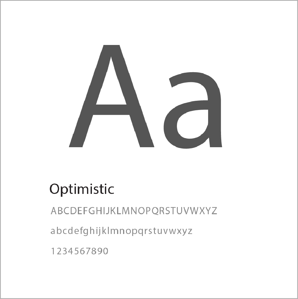
TYPOGRAPHY
As part of the company's branding guidelines, we are using Optimistic text which is a typeface exclusive to the company.
As part of the company's branding guidelines, we are using Optimistic text which is a typeface exclusive to the company.
COLOR PALETTE
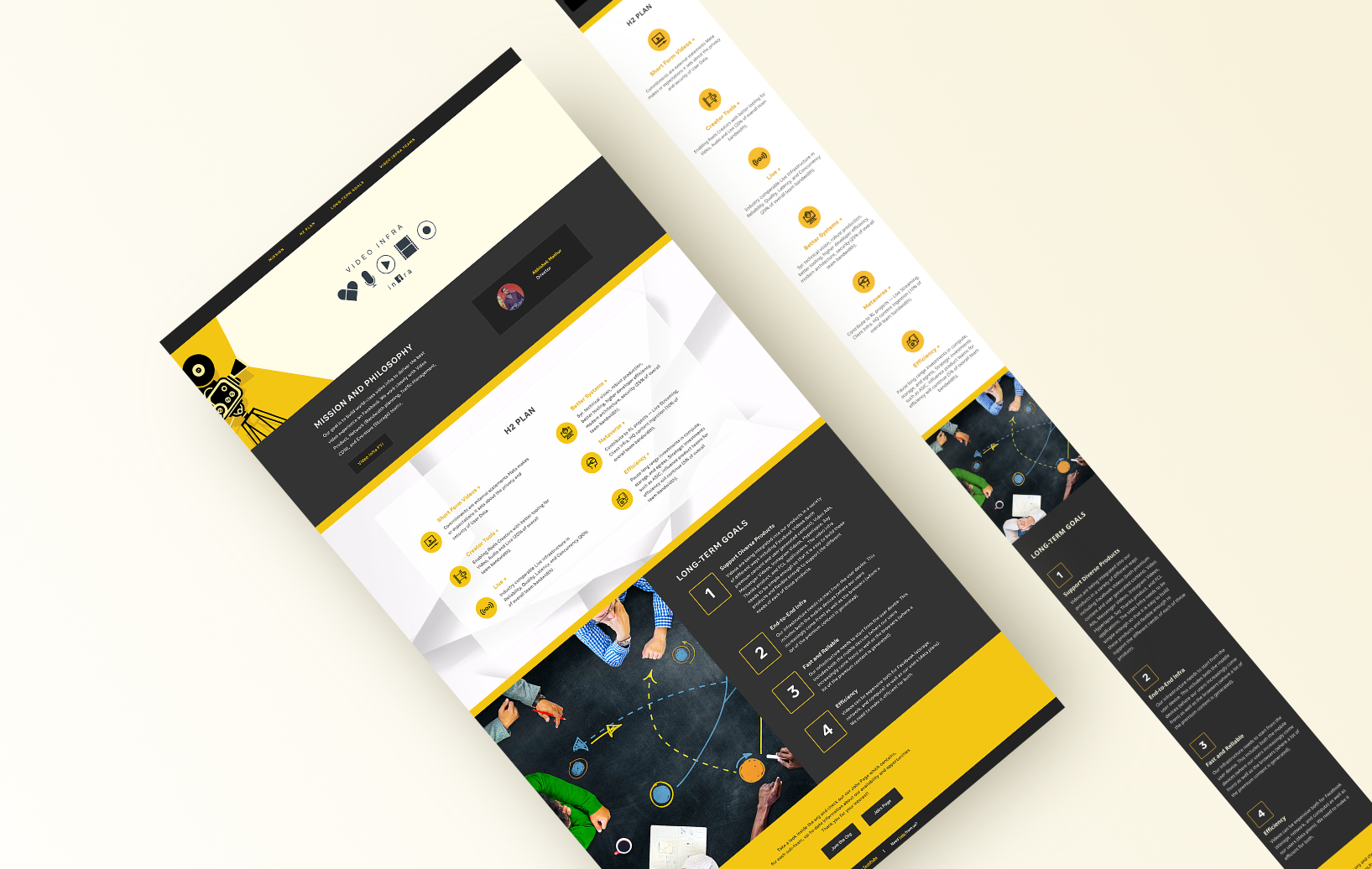
When the stakeholder mentioned that they wanted the site to "pop", the color yellow immediately came to mind. I decided to use it as my accent color, mixed with neutral colors black and gray that should balance the feel of the colors. This color mix gives a very modern urban perception.
When the stakeholder mentioned that they wanted the site to "pop", the color yellow immediately came to mind. I decided to use it as my accent color, mixed with neutral colors black and gray that should balance the feel of the colors. This color mix gives a very modern urban perception.
VISUAL POWER
Ui being an emphasis, I wanted a design relatable to the stakeholders. I added a subtle video background on sheer white container (see prototype video) to create some movement and highlight the section, also the stakeholders being video enthusiasts. As a contrast to this section, I added a fitting image for the next section on black to create a difference that made each other pop.
Ui being an emphasis, I wanted a design relatable to the stakeholders. I added a subtle video background on sheer white container (see prototype video) to create some movement and highlight the section, also the stakeholders being video enthusiasts. As a contrast to this section, I added a fitting image for the next section on black to create a difference that made each other pop.

Prototype
disclaimer: colors in video recording may vary depending on individual screen
THE FLOW
The flow of this page is very simple. Users will instantly have access to the section they are looking for using the fixed nav bar. As they go through the page, they will find the content designed with images representing the sections.
The flow of this page is very simple. Users will instantly have access to the section they are looking for using the fixed nav bar. As they go through the page, they will find the content designed with images representing the sections.
"WE LOVE IT!"
Once we were happy with the design. I received the approval from the stakeholders to develop it, and after sending the published design to them, I was very happy to hear them say that they loved everything. We had to make a few more changes with the texts after that, but overall they were very pleased with how the page turned out — the links, the images, navigation. It was a short page, but nevertheless, the users were able appreciate the page and were able to use it with ease.
Once we were happy with the design. I received the approval from the stakeholders to develop it, and after sending the published design to them, I was very happy to hear them say that they loved everything. We had to make a few more changes with the texts after that, but overall they were very pleased with how the page turned out — the links, the images, navigation. It was a short page, but nevertheless, the users were able appreciate the page and were able to use it with ease.