Orangepeople (OP) is an enterprise digital transformation services agency. They provide talents to different companies to support them with their daily operation. This design project was provided to them was a sample project for assessment.
ROLE
graphic, web UX/UI designer
graphic, web UX/UI designer
DATE
April 2023
April 2023

Overview
OBJECTIVE
The main objective of the project was to create a landing page for a recruiting agency. The information were all provided by the stakeholder. It was expected to layout and design the page to feel professional, and also to communicate to different users in various fields in technology.
The main objective of the project was to create a landing page for a recruiting agency. The information were all provided by the stakeholder. It was expected to layout and design the page to feel professional, and also to communicate to different users in various fields in technology.
THE CHALLENGE
Create a landing page that would represent the agency
Create a landing page that would represent the agency

Ideation
Research is a vital part of designing. After gathering information from the stakeholders, whom I considered my subjects on this project, I found out that their current landing page has issues with readability and hierarchy. Some images and visual elements seem misplaced. These issues are the things that I had to address.
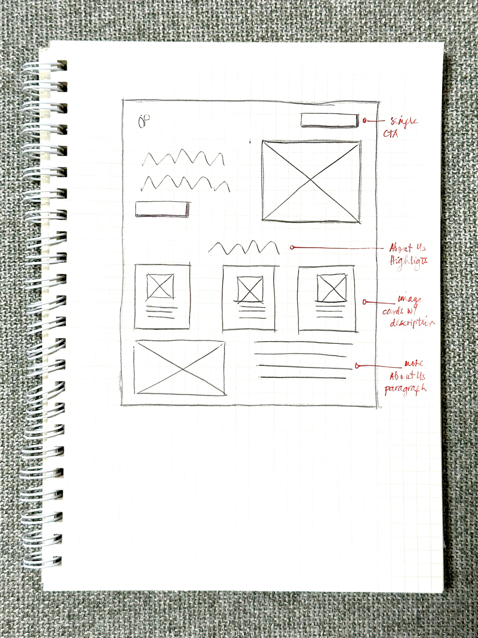

WIREFRAMING
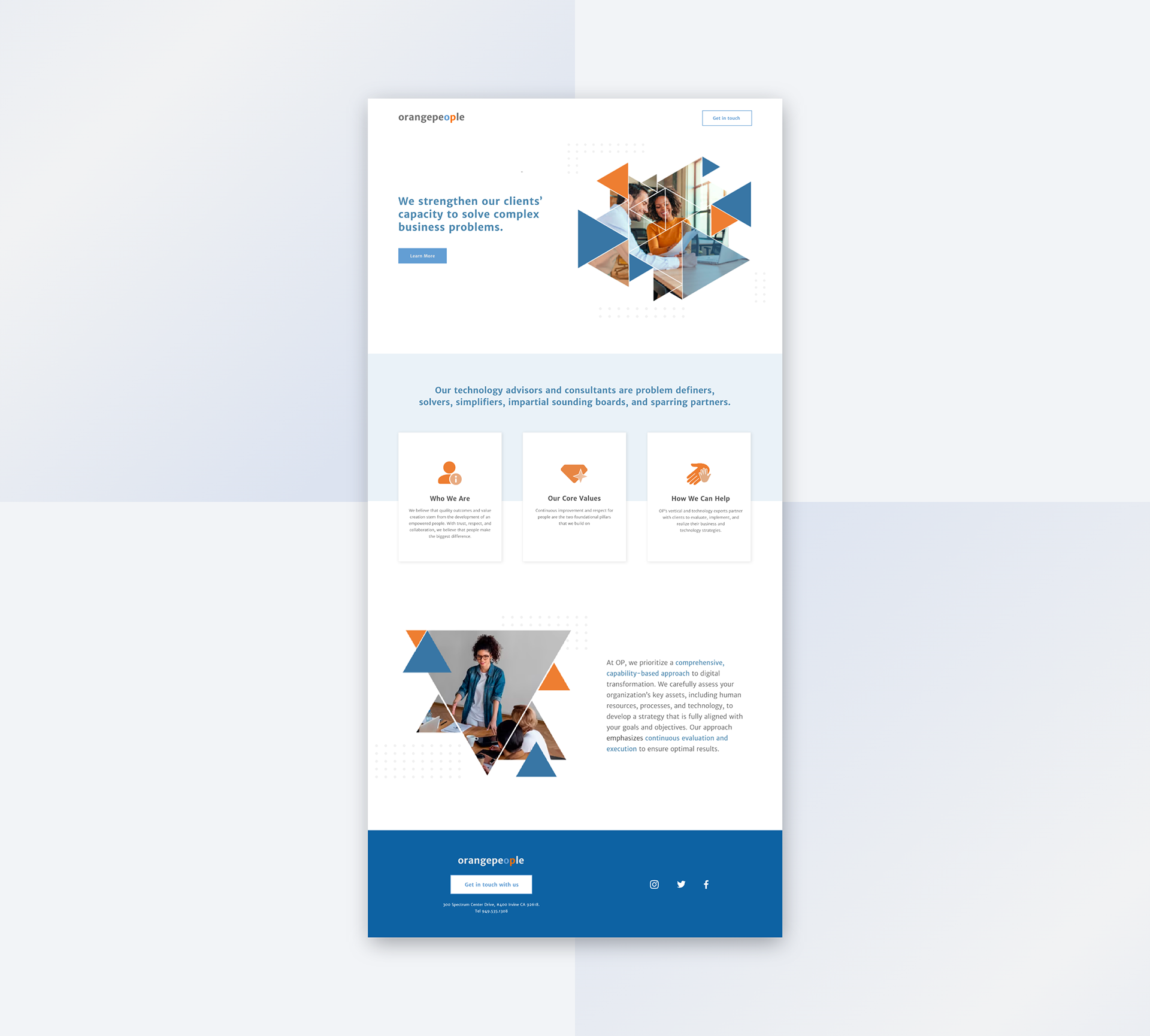
As I brainstorm on how I wanted to outline the content of the page. I had an understanding that what was needed for this landing page is a design that is plain and simple. A layout designed that will allow the company to introduce itself and provide core information to users. The sketch above is what I came up with, something that is very direct and only having the essentials.
As I brainstorm on how I wanted to outline the content of the page. I had an understanding that what was needed for this landing page is a design that is plain and simple. A layout designed that will allow the company to introduce itself and provide core information to users. The sketch above is what I came up with, something that is very direct and only having the essentials.
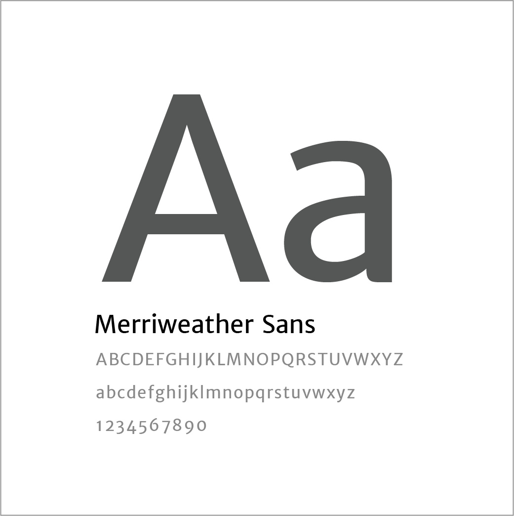
TYPOGRAPHY
We went for clean typography, using Merriweather Sans throughout in shade of grey for its bold traditional feeling despite having modern shapes.
We went for clean typography, using Merriweather Sans throughout in shade of grey for its bold traditional feeling despite having modern shapes.
COLOR PALETTE
After outlining the frame, it's time to work on the UI. The complementary blue and orange color palette (above) was inspired by the company's brightly colored logo.
After outlining the frame, it's time to work on the UI. The complementary blue and orange color palette (above) was inspired by the company's brightly colored logo.
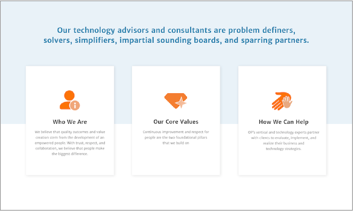
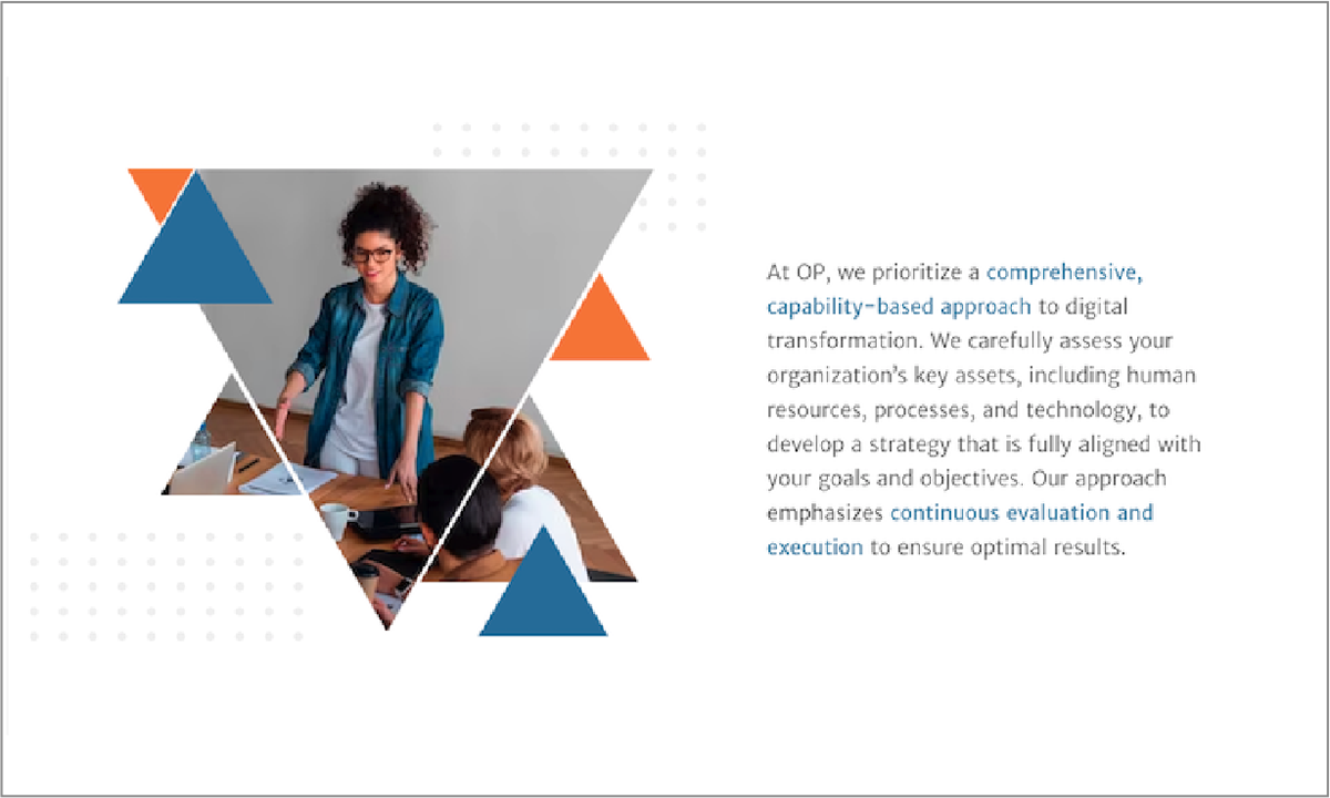
VISUAL POWER
The key solution was to focus on the typography and — Merriweather Sans, and layout, also to create imagery that would translate to users as "corporate and professional". As a recruiting agency, emphasis was to the most "catchy" statements in the texts provided by the stakeholder, through this, users can have a better understanding of what the company is all about. In addition to that, shapes with hard corners are in decorative use to give a feeling of sharpness and stability, with imagery of professionals working together to invoke the feeling of cooperation among peers was a design decision that is simple but should be impactful.
The key solution was to focus on the typography and — Merriweather Sans, and layout, also to create imagery that would translate to users as "corporate and professional". As a recruiting agency, emphasis was to the most "catchy" statements in the texts provided by the stakeholder, through this, users can have a better understanding of what the company is all about. In addition to that, shapes with hard corners are in decorative use to give a feeling of sharpness and stability, with imagery of professionals working together to invoke the feeling of cooperation among peers was a design decision that is simple but should be impactful.

Prototype
READY TO HIRE
I was very pleased and appreciative of the opportunity to work and create some inspiration for the stakeholder. I hope this design brings out good results and increase their web presence for long-term gains.
I was very pleased and appreciative of the opportunity to work and create some inspiration for the stakeholder. I hope this design brings out good results and increase their web presence for long-term gains.