
Monet is an e-commerce web and mobile site made to create AI generated art. Users will be able to create unique art pieces, print them, have it framed, before it gets shipped and hanged on the wall. Users will get the opportunity to create and own one-of-a-kind art pieces by using this product.
ROLE
Visual and Product designer
Visual and Product designer
DATE
August 2024
August 2024

Overview
OBJECTIVE
The goal of the project was to create a brand identity and design the UX process of the product where users can generate AI art images and purchase the art.
The goal of the project was to create a brand identity and design the UX process of the product where users can generate AI art images and purchase the art.
TARGET AUDIENCE
The target audience for this product are predominantly college men and women between 17-25 years old.
The target audience for this product are predominantly college men and women between 17-25 years old.

The Problem
Let's say you have a thing for art but you don't exactly have the time nor the talent to produce your own, and buying a mass produced art piece doesn't hit the spot for you. How can you acquire a unique custom art piece, and get the exact feel that you are looking for in art? The inability to acquire a unique art without shedding cash, or finding one that feels exactly how you imagine it is a problem that gives us an opportunity to solve.

Research and Discovery
We have discovered that 100% of our respondents will likely use their mobile phones to use this product. With that said, we will focus on the mobile version of the product.
Respondents have provided useful insights including; some expressed great interest in using the product with certain conditions like — mobile accessibility, ease of use, and overall feel of the product. All respondents expressed considerable preference in "clutter-free" user interface.

CHECKING OUT THE COMPETITION
It always helps to look at competitors (above) and learn from their mistakes. There were quite a number of websites that have AI image generator, but most of them do not have image generation access at hand.
It always helps to look at competitors (above) and learn from their mistakes. There were quite a number of websites that have AI image generator, but most of them do not have image generation access at hand.

Ideation
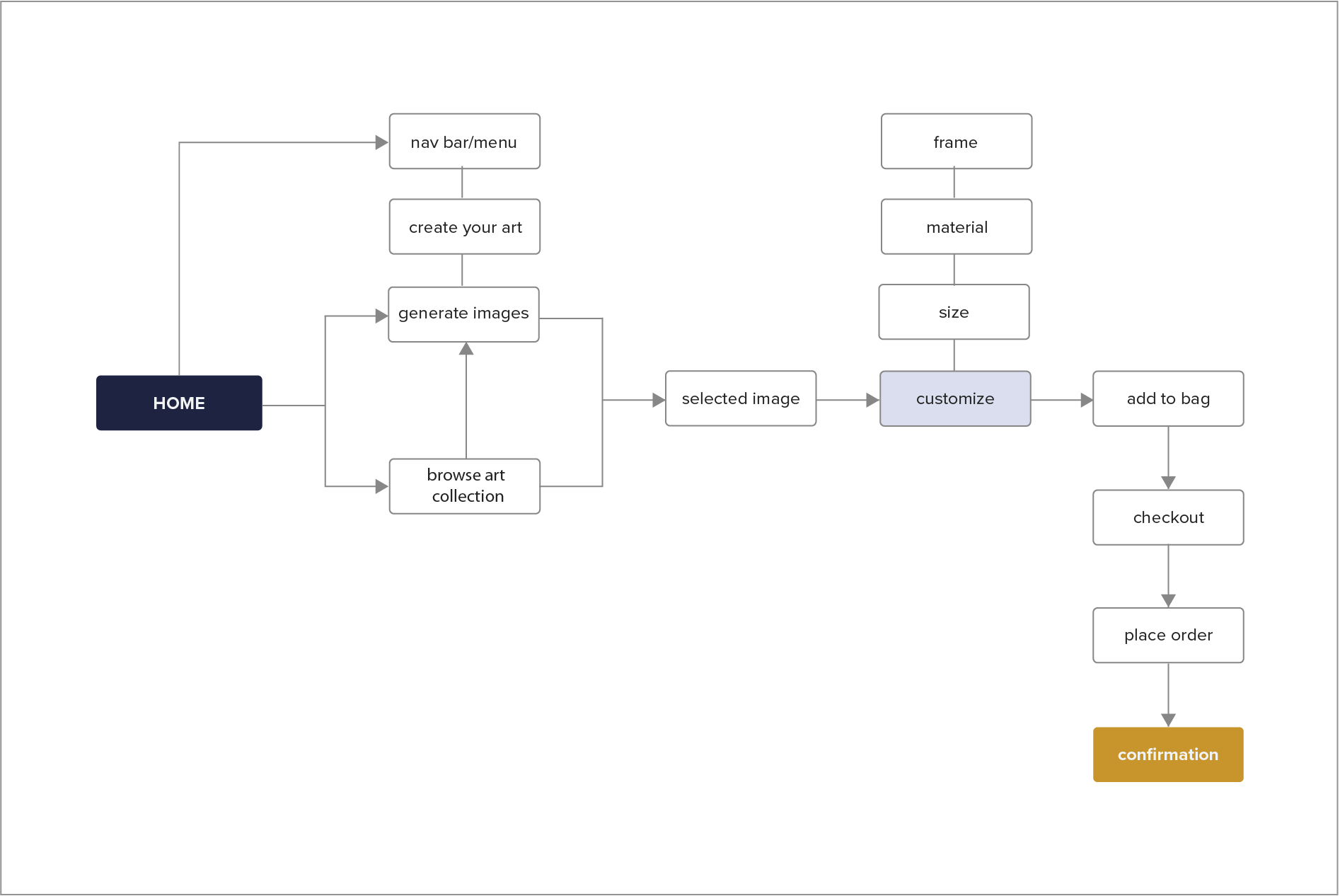
USER FLOW
I wanted to keep the flow and interaction simple. Users will go through the same process regardless of which flow was taken; a design solution to improve interaction and address users' pain point of "ease of use".
I wanted to keep the flow and interaction simple. Users will go through the same process regardless of which flow was taken; a design solution to improve interaction and address users' pain point of "ease of use".

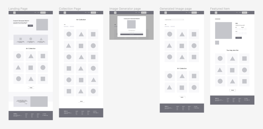
CREATING THE LO-FI
It was clear that what we needed was a simple layout for web and mobile that outlined the product’s purpose and will give potential users a way to navigate around the product with ease.
It was clear that what we needed was a simple layout for web and mobile that outlined the product’s purpose and will give potential users a way to navigate around the product with ease.
mobile home
mobile subpage
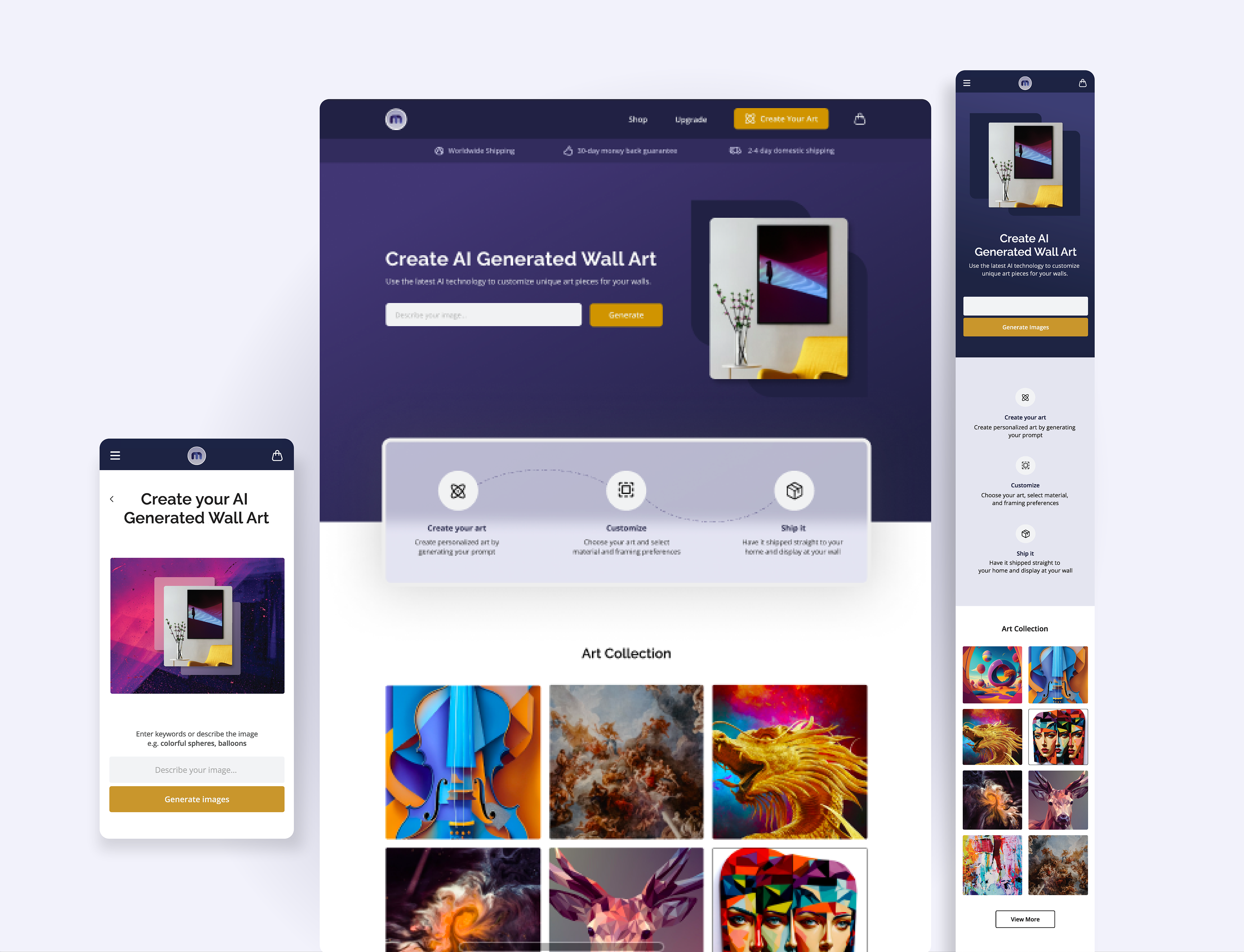
web home
web nav bar
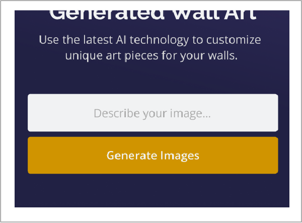
SOLVING A USER PAIN POINT
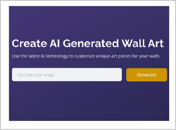
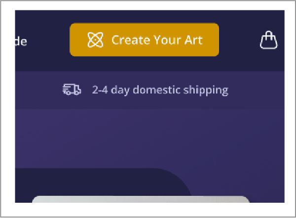
One potential user pain point is the accessibility to the image generator to fulfill a task, a CTA button will always be available; 1) on the landing page prompter; 2) using the fixed navbar/menu and tapping the "Create your Art" button; or 3) on subpages where the button will also be fixed on the screen as the users scroll up and down. This solution is to make sure users can always have access to the generator.
One potential user pain point is the accessibility to the image generator to fulfill a task, a CTA button will always be available; 1) on the landing page prompter; 2) using the fixed navbar/menu and tapping the "Create your Art" button; or 3) on subpages where the button will also be fixed on the screen as the users scroll up and down. This solution is to make sure users can always have access to the generator.
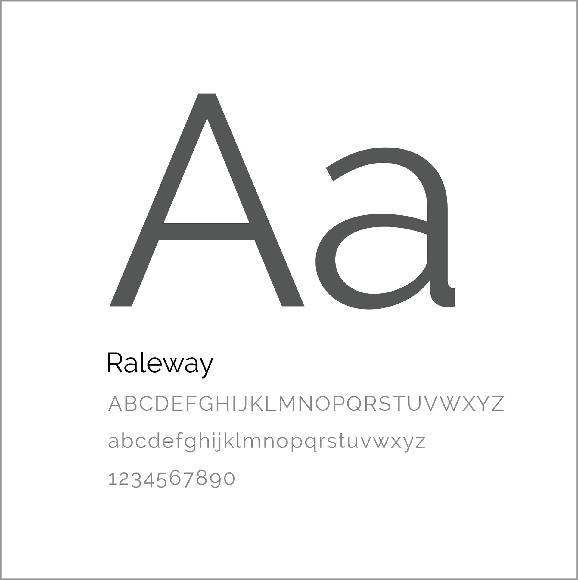
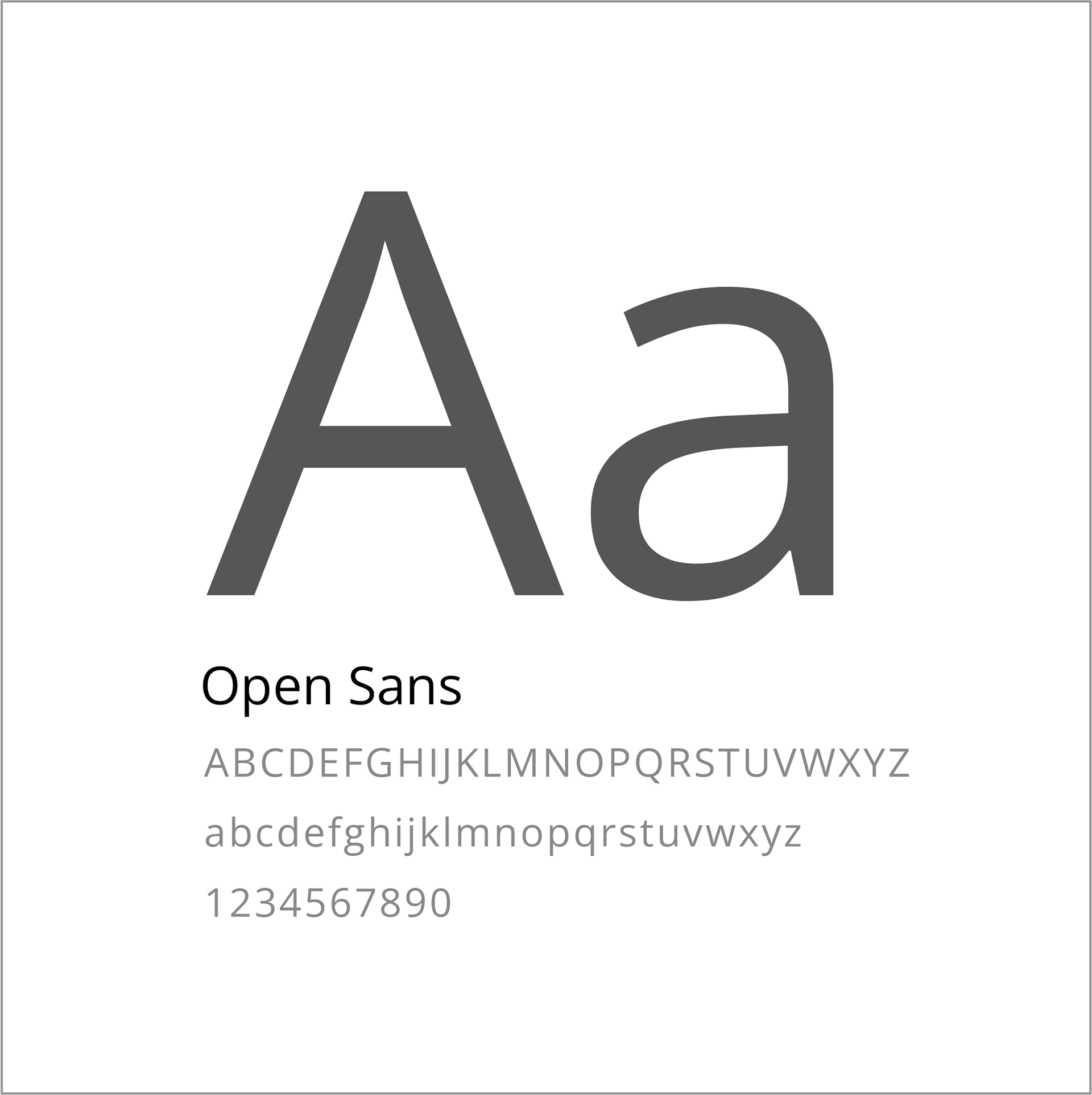

TYPE PAIRING AND COLOR PALETTE
We went for clean, modern, and crisp typography, using Raleway for the header and Open Sans throughout in varying shades of gray. As for the color palette, considering the target audience, we decided to mix colors that are perceived to be gender neutral. The shades of blue were choices that are perceived to relate to technology, and the yellow was to make sure it can pop and connect to female audience and balance the whole feel of the colors.
We went for clean, modern, and crisp typography, using Raleway for the header and Open Sans throughout in varying shades of gray. As for the color palette, considering the target audience, we decided to mix colors that are perceived to be gender neutral. The shades of blue were choices that are perceived to relate to technology, and the yellow was to make sure it can pop and connect to female audience and balance the whole feel of the colors.

Prototype
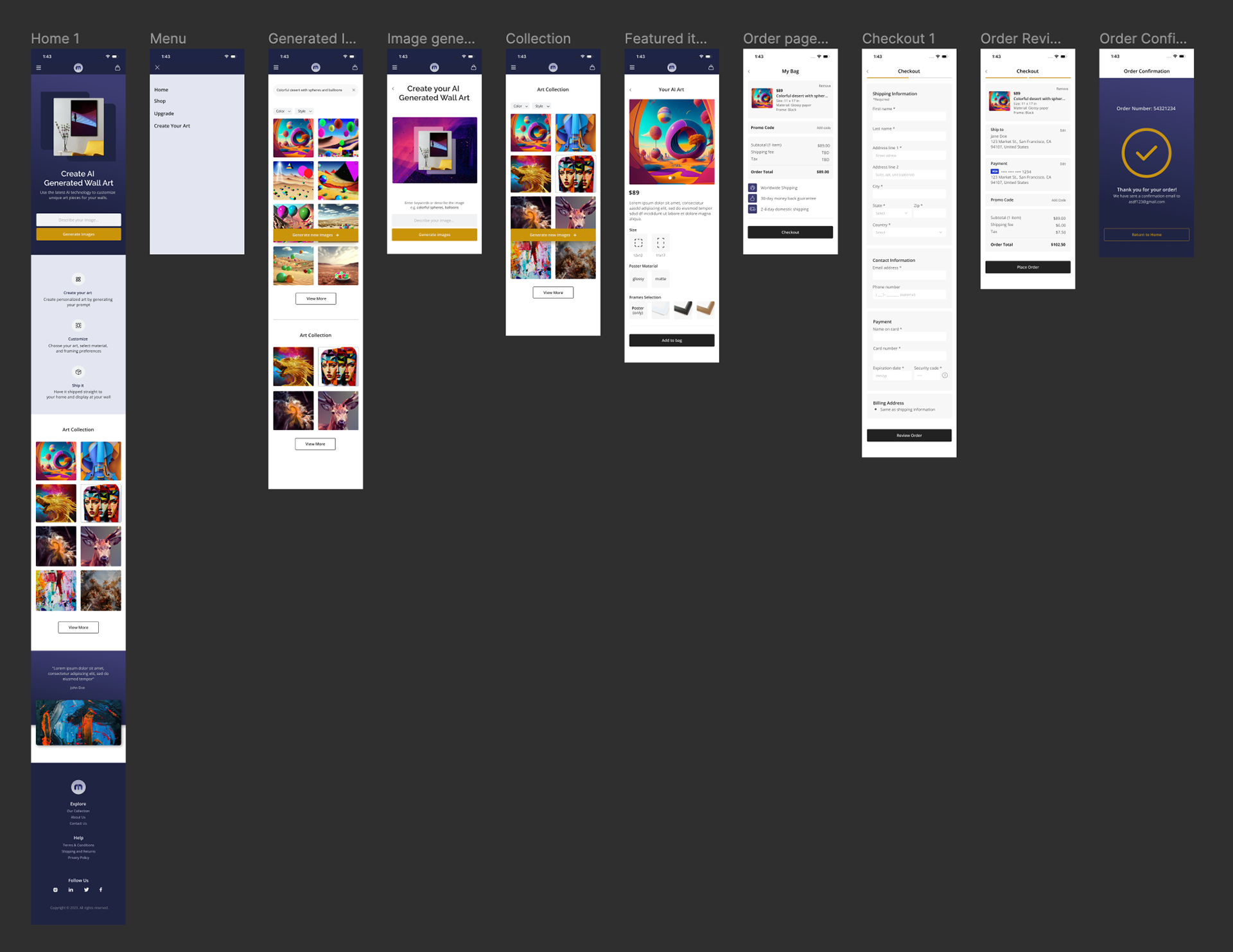
mobile version

web version
As we interview our target audience, we have discovered that 100% of our respondents will most likely use their mobile phones to use this product. With that said, our main focus was on the mobile version of the product
user flow 1
user flow 2
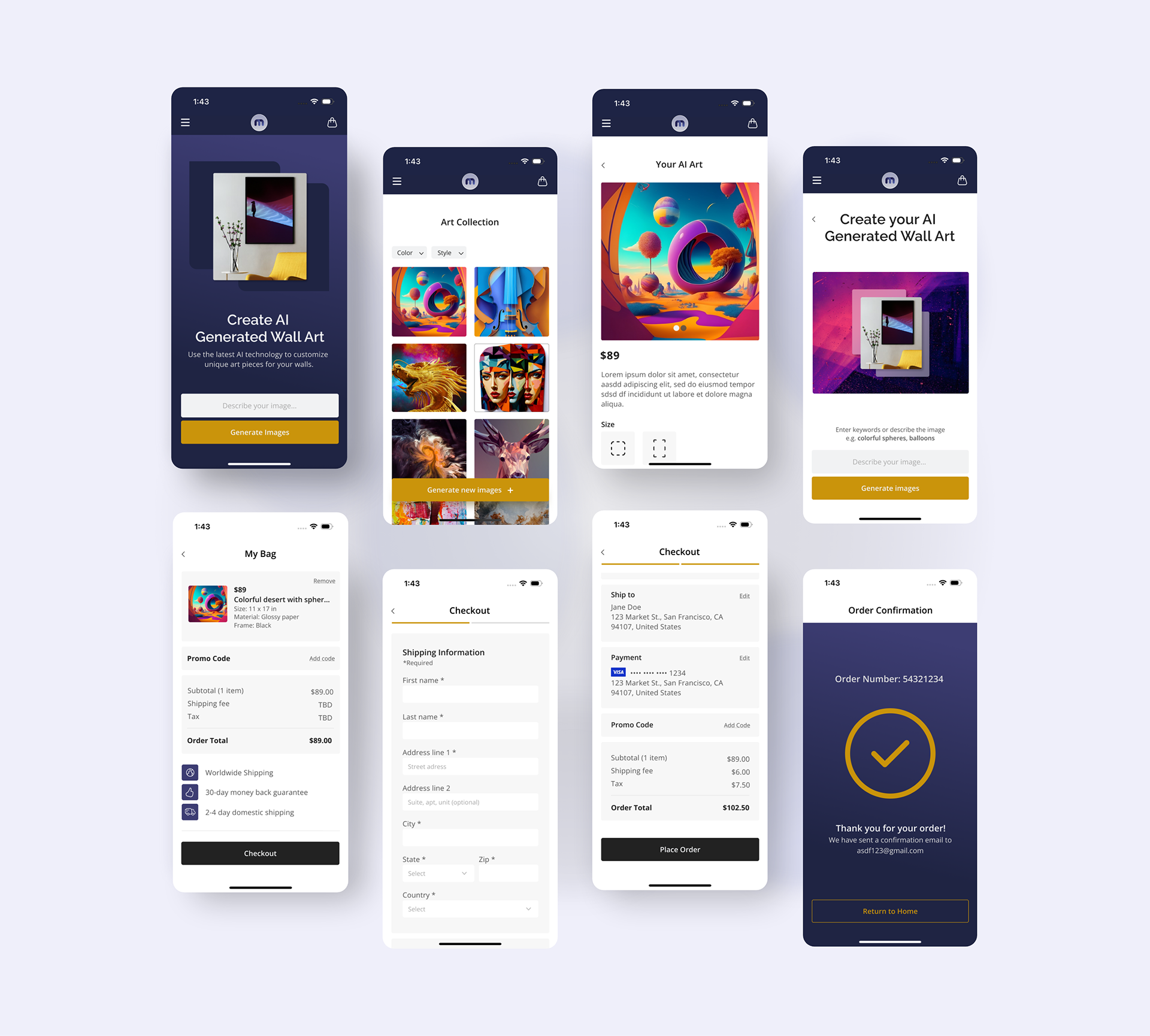
USER FLOW 1
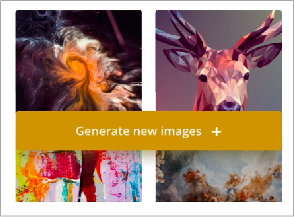
This flow uses prompt to generate images in different ways. Users will have 3 accesses to generate their prompt; 1) through the menu button, clicking or tapping "Create new art"; 2) through the prompter and "Generate Images" CTA on the landing page; or 3) by using the fixed "Generate new images" CTA on the landing page or subpages. Users can then select the image and customize it based on the given options. They will then go through the "Add to bag" and "Checkout" process to finish this flow. Having few ways to use the generate function creates a "redundancy gain" for users that can increase in processing speed and accuracy.
This flow uses prompt to generate images in different ways. Users will have 3 accesses to generate their prompt; 1) through the menu button, clicking or tapping "Create new art"; 2) through the prompter and "Generate Images" CTA on the landing page; or 3) by using the fixed "Generate new images" CTA on the landing page or subpages. Users can then select the image and customize it based on the given options. They will then go through the "Add to bag" and "Checkout" process to finish this flow. Having few ways to use the generate function creates a "redundancy gain" for users that can increase in processing speed and accuracy.
USER FLOW 2
The flow happens when users browse through the art collection. After browsing and selecting the preferred image, users will go through the same process as the flow 1 wherein they can add their customization preferences followed by adding the image to the bag and completing the checkout process that is similar to flow 1.
The flow happens when users browse through the art collection. After browsing and selecting the preferred image, users will go through the same process as the flow 1 wherein they can add their customization preferences followed by adding the image to the bag and completing the checkout process that is similar to flow 1.
GET READY TO MAKE SOME ART
The project is currently on stealth mode, but once the stakeholders (and myself) were happy with the design, we did an A/B testing and were thrilled that our testers provided amazing feedback, specifically on how easy the navigation was for them and some compliments to the UI design. My experience working on this project was challenging in different ways, it's very interesting how simple issues an/or fixes can be very impactful to the user experience.
The project is currently on stealth mode, but once the stakeholders (and myself) were happy with the design, we did an A/B testing and were thrilled that our testers provided amazing feedback, specifically on how easy the navigation was for them and some compliments to the UI design. My experience working on this project was challenging in different ways, it's very interesting how simple issues an/or fixes can be very impactful to the user experience.