
GFS (Global Field Services) is an internal team x Meta that handles product enablement for data center, network design, delivery, and operations. This was the 2nd time I worked with the stakeholders. They're back as they were in need of a new site for a new team and needed to organize their assets and create a resources page.
ROLE
graphic, web UX/UI designer, developer
graphic, web UX/UI designer, developer
DATE
Feb 2023
Feb 2023

Overview
OBJECTIVE
The goal of the project was to create the team's page. This includes organizing the given content and making sure users can effectively use the platform to help them use it as a resources page.
The goal of the project was to create the team's page. This includes organizing the given content and making sure users can effectively use the platform to help them use it as a resources page.
TARGET AUDIENCE
Meta Infrastructure Data Center — Edge Network Services employees. This department has several hundreds of employees globally.
Meta Infrastructure Data Center — Edge Network Services employees. This department has several hundreds of employees globally.
KEY CHALLENGES
• organize the content for each section
• create and include compelling graphics and images
• organize the content for each section
• create and include compelling graphics and images

Ideation
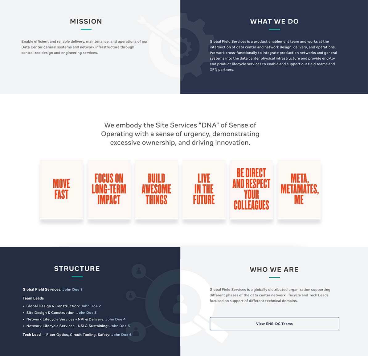
After doing a project briefing with the stakeholders, I had an understanding that what they were looking for was a design that would layout a summary of what the team is about. With this in mind, I had to create a structure that would outline and reflect the team's nature using visual elements — graphics, images, typography, and colors
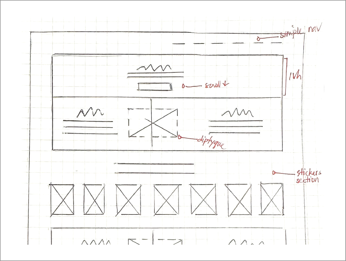
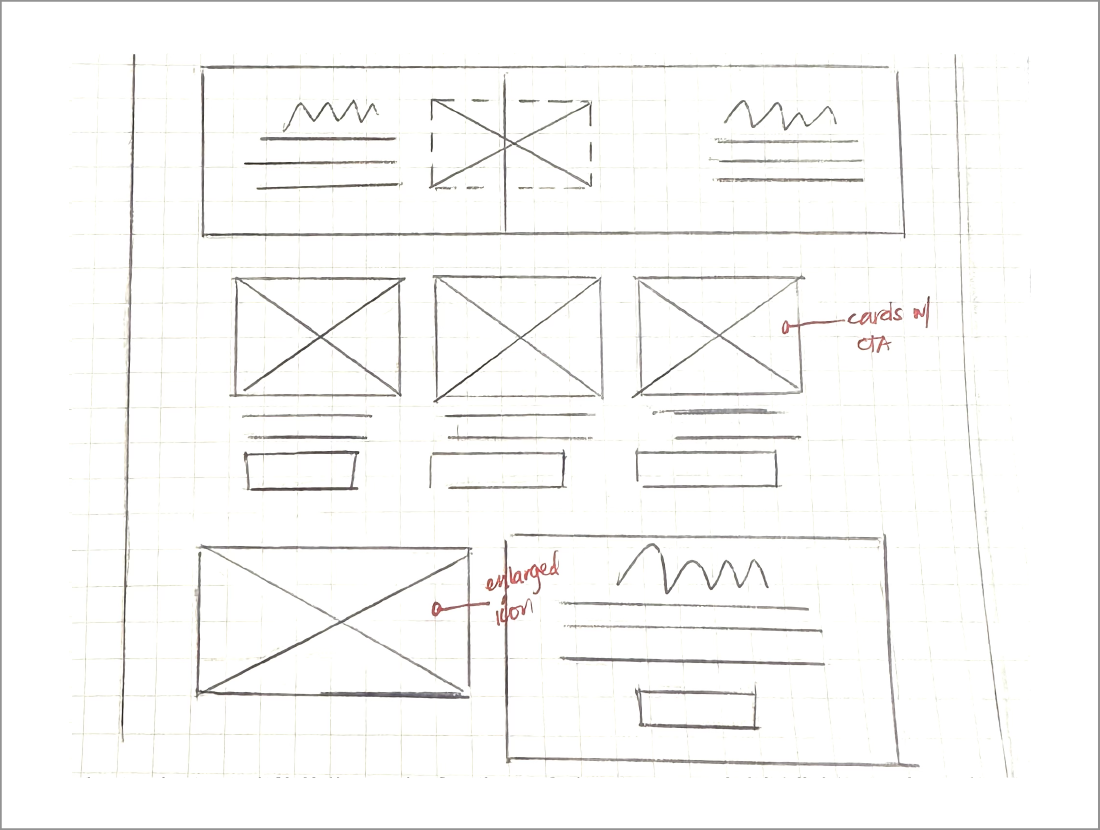


WIREFRAMING
Considering that the content was already provided. I wanted to draft a layout to find places for the graphics that I wanted to include in the design. Each section was represented by a graphic or an image the translated the subject of each section. Also, I wanted to use the concept of a "diptyque" or a two-panel image to translate some of these sections.
Considering that the content was already provided. I wanted to draft a layout to find places for the graphics that I wanted to include in the design. Each section was represented by a graphic or an image the translated the subject of each section. Also, I wanted to use the concept of a "diptyque" or a two-panel image to translate some of these sections.
TYPOGRAPHY
As part of the company's branding guidelines, we are using Optimistic text which is a typeface exclusive to the company.
As part of the company's branding guidelines, we are using Optimistic text which is a typeface exclusive to the company.
COLOR PALETTE
We used a couple of shades of blue to represent technology and teal as the accent color to give the look a "pop", and also because the team is about building networks, this color was very suitable as it represents "renovation" and "open communication".
We used a couple of shades of blue to represent technology and teal as the accent color to give the look a "pop", and also because the team is about building networks, this color was very suitable as it represents "renovation" and "open communication".

VISUAL POWER
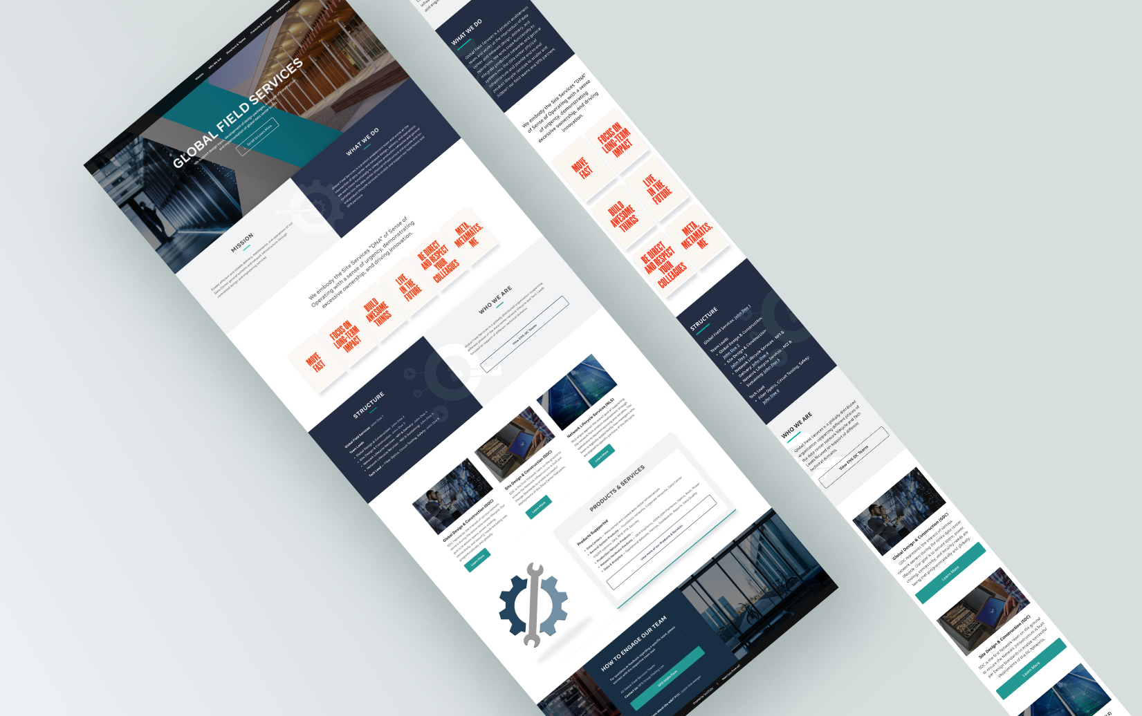
To add compelling images is what I had in mind to improve engagement on this site. The hero section used images from one of the company data centers — the server room and building structure. Having these images gives will give visual familiarity to the users. On top of those, I added more graphics throughout the page that are also familiar and users can see all over the company network and structures across the globe — the meta stickers.
"Diptyque" or two-panel images were also added on the page. This was something visually fun to see, and at the same time served a purpose by representing some of the sections of the page.

Prototype
disclaimer: colors in video recording may vary depending on individual screen
THE FLOW
The flow of this page is very simple. Users will instantly have access to the section they are looking for using the fixed nav bar. As they go through the page, they will find the content designed with images representing the sections.
The flow of this page is very simple. Users will instantly have access to the section they are looking for using the fixed nav bar. As they go through the page, they will find the content designed with images representing the sections.
HAPPY STAKEHOLDER (AGAIN) :)
This was the second time I worked with the stakeholder. Once we were happy with the design, I developed it using basic HTML/CSS, and after publishing the design for testing, we got a lot of amazing feedback from users, giving compliments on how visually pleasing the page was and easy to navigate. While the scope of the design was limited, it was very fun to work on. Another demonstration of how purely visual design can have a significant impact on the user experience and engagement of a homepage.
This was the second time I worked with the stakeholder. Once we were happy with the design, I developed it using basic HTML/CSS, and after publishing the design for testing, we got a lot of amazing feedback from users, giving compliments on how visually pleasing the page was and easy to navigate. While the scope of the design was limited, it was very fun to work on. Another demonstration of how purely visual design can have a significant impact on the user experience and engagement of a homepage.