
ERAD is short for "eradication". The team is responsible for handling data that needs to be removed from the system. They were in need of a landing page that they can use as reference for their day-to-day operation. The landing page was designed based on the theme of their main department, and also help improve the user experience.
ROLE
web UX/UI designer
web UX/UI designer
DATE
July 2022
July 2022

Overview
OBJECTIVE
After the project briefing with the stakeholder, it was noted that the landing page should follow the same theme as the department. It was clear that the design should have a professional, corporate aesthetic that will appeal to the engineers and other technology sector. More importantly, we wanted to focus on the user experience and be sure that users will be able to intuitively find the reference they are searching to perform their job. This will be based on the data collected that shows which references have high priorities.
After the project briefing with the stakeholder, it was noted that the landing page should follow the same theme as the department. It was clear that the design should have a professional, corporate aesthetic that will appeal to the engineers and other technology sector. More importantly, we wanted to focus on the user experience and be sure that users will be able to intuitively find the reference they are searching to perform their job. This will be based on the data collected that shows which references have high priorities.
TARGET AUDIENCE
Meta Infrastructure Data Center — IBIZ employees. This department has hundreds of employees globally.
Meta Infrastructure Data Center — IBIZ employees. This department has hundreds of employees globally.
KEY CHALLENGES
• simplify the UX/UI without omitting necessary content
• the page has several links and will require prioritization
• simplify the UX/UI without omitting necessary content
• the page has several links and will require prioritization

Ideation

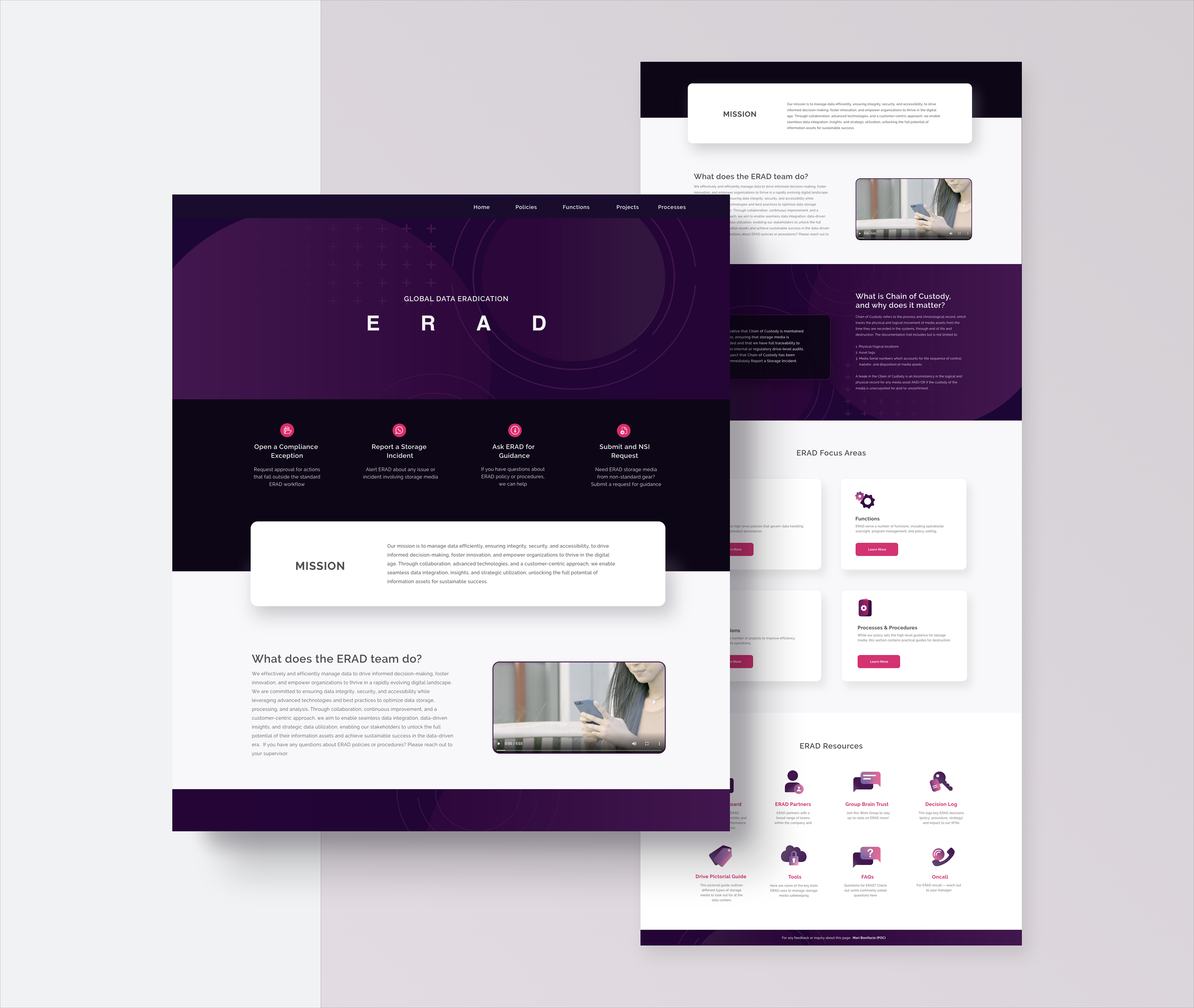
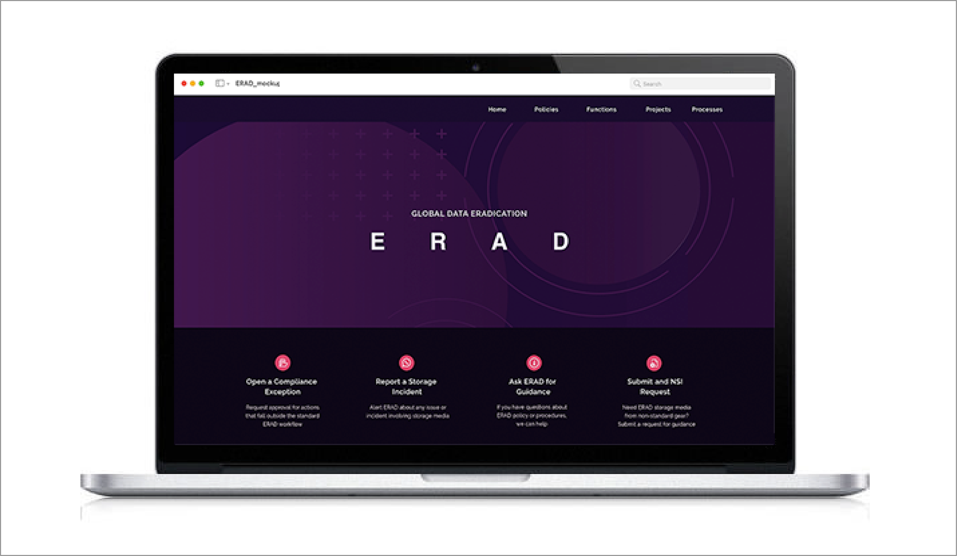
WIREFRAMING
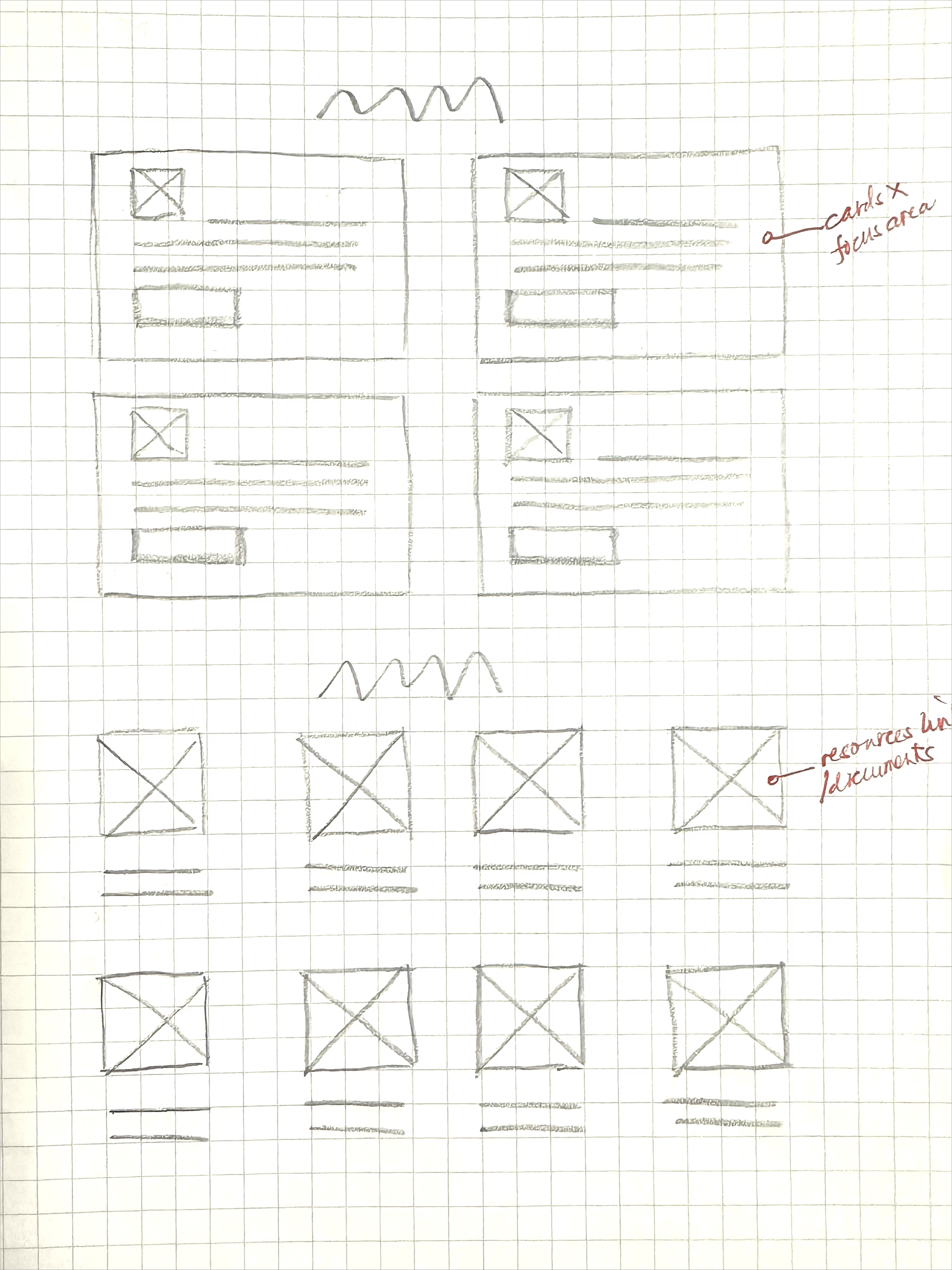
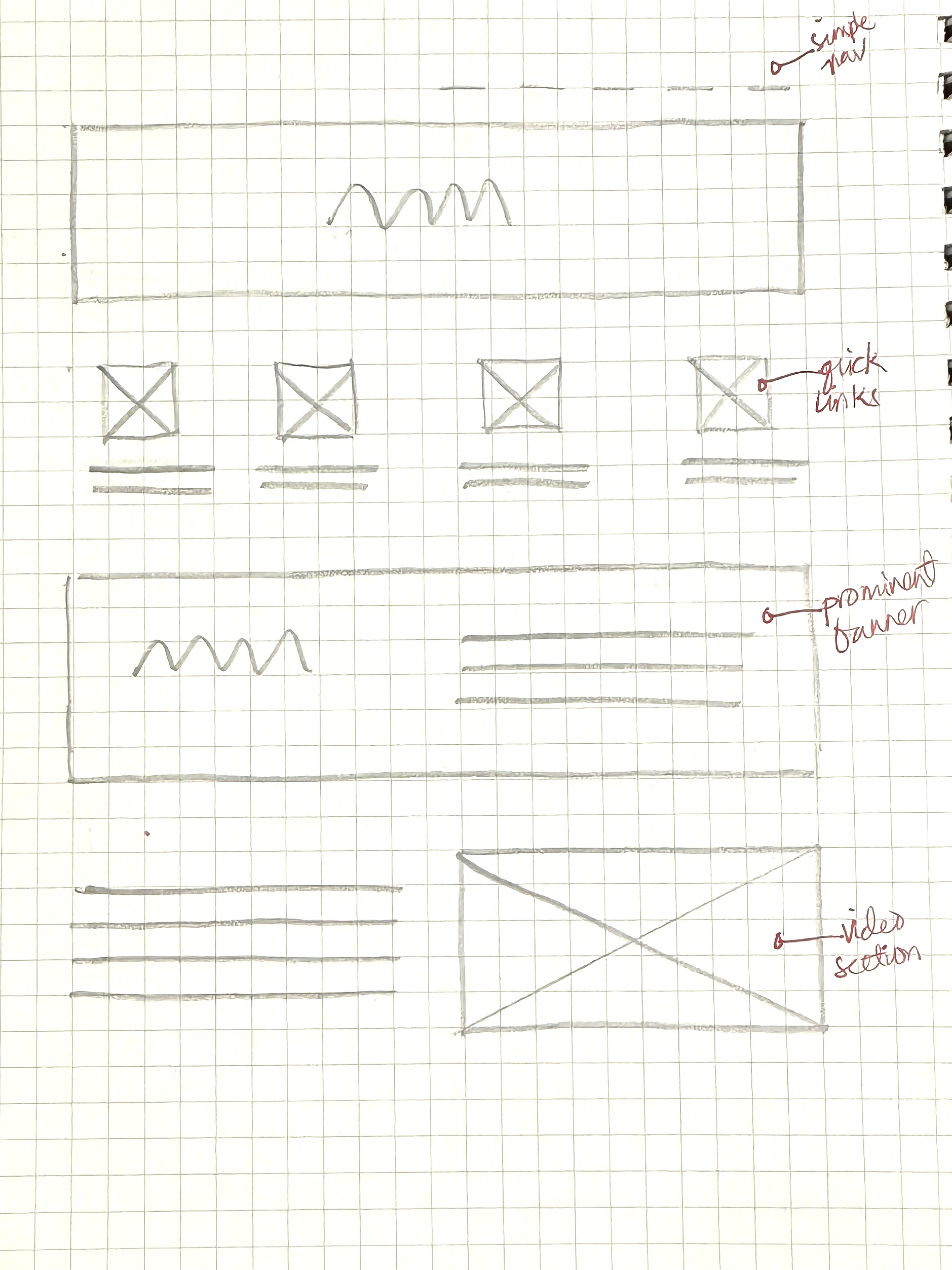
As I received the content from the stakeholders, I noticed that there were a handful of links that I needed to work on. I based the layout of the design having in mind that these links play a vital role for this homepage. I decided to make these links as intuitive as possible. By the use of icons, users can have a better understanding right away of what these icons are and differentiate them intuitively from each other.
As I received the content from the stakeholders, I noticed that there were a handful of links that I needed to work on. I based the layout of the design having in mind that these links play a vital role for this homepage. I decided to make these links as intuitive as possible. By the use of icons, users can have a better understanding right away of what these icons are and differentiate them intuitively from each other.
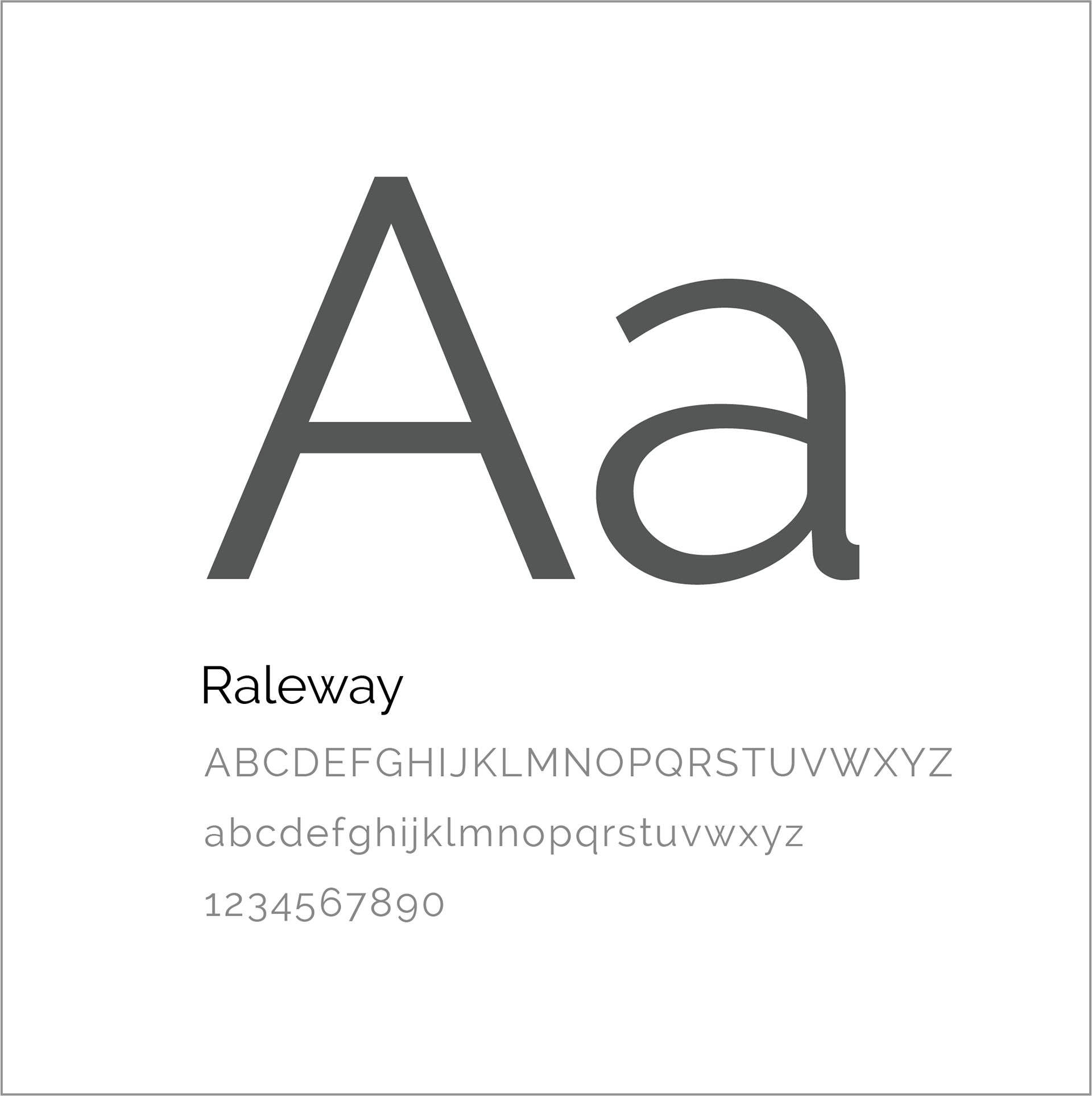
TYPOGRAPHY
We used a modern elegant typeface such as Raleway for the design to compliment the feeling from the color palette being in varying shades of violet.
We used a modern elegant typeface such as Raleway for the design to compliment the feeling from the color palette being in varying shades of violet.
COLOR PALETTE
The palette chosen were requested by the stakeholders to work with the colors of the team's main department that use the colors of maroon and violet. We wanted these colors for these to sites to be relative from each other.
The palette chosen were requested by the stakeholders to work with the colors of the team's main department that use the colors of maroon and violet. We wanted these colors for these to sites to be relative from each other.
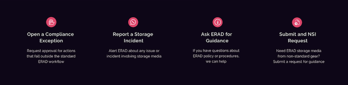
QUICK LINKS
These links are immediately available for users to access important references. Based on user research, these references were the most used and required higher priority. The solution was to create simple accesses to allow users easy access to different services the team offers. Clicking these links would redirect users to an external request form that would allow them to get the information and service they require.
These links are immediately available for users to access important references. Based on user research, these references were the most used and required higher priority. The solution was to create simple accesses to allow users easy access to different services the team offers. Clicking these links would redirect users to an external request form that would allow them to get the information and service they require.
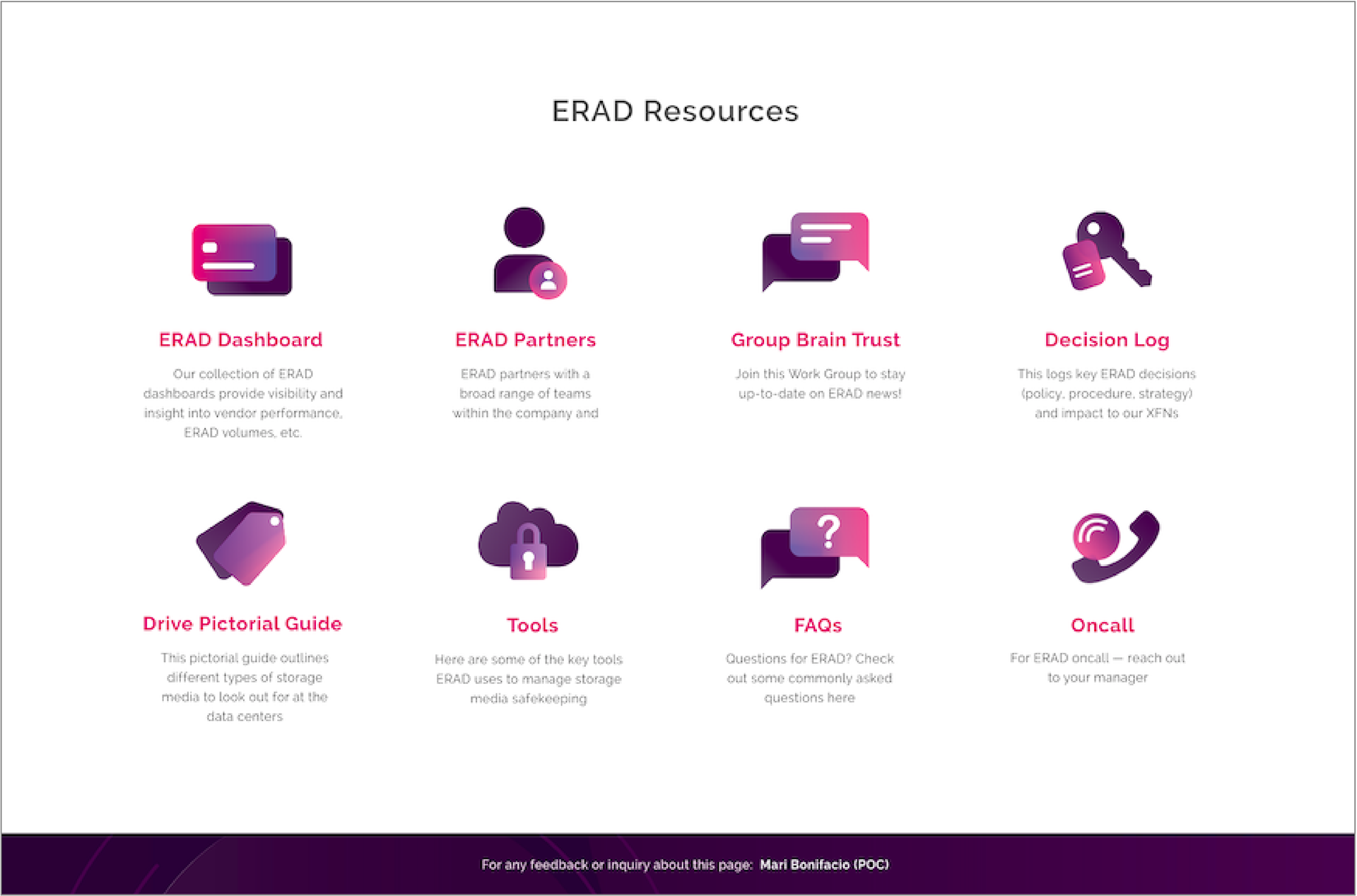
REINVENTION OF THE FOOTER
Instead of using a traditional footer for quick links, I took a different design approach for these resources that would look and feel more intuitive. Icons and descriptions are available for users to have a better understanding of the services offered.
Instead of using a traditional footer for quick links, I took a different design approach for these resources that would look and feel more intuitive. Icons and descriptions are available for users to have a better understanding of the services offered.

Prototype
MISSION ACCOMPLISHED
The stakeholder approved the design, and after development, user testing validated that users were able to find the information they were looking for. They were able to connect and find different services with ease. We also received feedback that requests from the new landing page has increased and upper management from the department were able to associate and compliment the new design. A project that I and the stakeholder can be proud of.
The stakeholder approved the design, and after development, user testing validated that users were able to find the information they were looking for. They were able to connect and find different services with ease. We also received feedback that requests from the new landing page has increased and upper management from the department were able to associate and compliment the new design. A project that I and the stakeholder can be proud of.