Platter is a recipe app for potlucks. The app is focused on providing recipes in big volume or servings for different occasions. The project aims to simplify the food app network "Tasty" and to cater to a more specific demographic.
ROLE
UI designer
UI designer
DATE
December 2019
December 2019
Overview
OBJECTIVE
The main objective of this project is to redesign the UI of TASTY app and make one of its features its own thing and have more focus on that purpose. This project is about the UI of a potluck recipe app.
The main objective of this project is to redesign the UI of TASTY app and make one of its features its own thing and have more focus on that purpose. This project is about the UI of a potluck recipe app.
KEY CHALLENGES
• simplify the UI and content
• create a label for the app
• trying not to make adjustments with the current UX design
• simplify the UI and content
• create a label for the app
• trying not to make adjustments with the current UX design
HOW IS IT SIMILAR TO TASTY?
Tasty being in the Editor’s Choice list, has a vast content. It’s so wide and yet it was able to keep consistency in providing the same information in all its recipes and how a user can interact with these information. Platter emulated that content. An example is having a “Video" and "Step-by-step” section of the recipes, Also, the ability to download the recipe and share it in social media as well as a personal diary/blog.
Tasty being in the Editor’s Choice list, has a vast content. It’s so wide and yet it was able to keep consistency in providing the same information in all its recipes and how a user can interact with these information. Platter emulated that content. An example is having a “Video" and "Step-by-step” section of the recipes, Also, the ability to download the recipe and share it in social media as well as a personal diary/blog.
HOW IS IT DIFFERENT FROM TASTY?
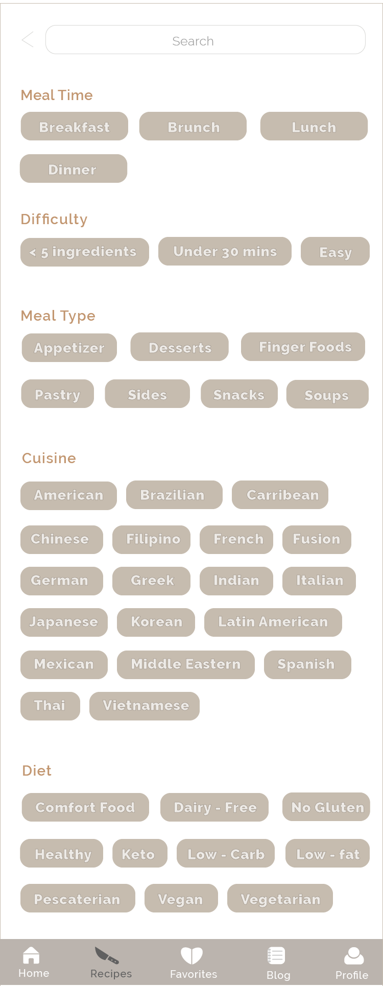
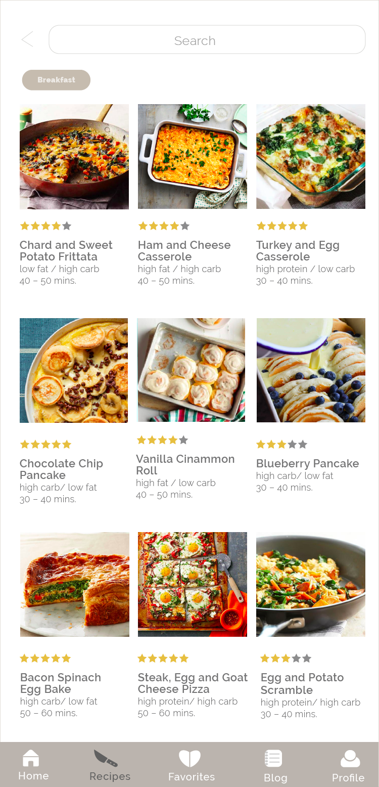
The interface of Platter is focused on giving the app a more organic look, Tasty uses colors that are typically not associated with food, like cyan and fuchsia pink (exclusive of sweets). Cooking in the kitchen can be messy and so the app would like to keep a sophisticated and clean vibe to impart that mood to its users.
The interface of Platter is focused on giving the app a more organic look, Tasty uses colors that are typically not associated with food, like cyan and fuchsia pink (exclusive of sweets). Cooking in the kitchen can be messy and so the app would like to keep a sophisticated and clean vibe to impart that mood to its users.
Design Solutions
• The recipe is simplified by organizing the page content and hierarchy.
• Adding tabs to categorize the instructions for easier navigation
• Working in the kitchen can be stressful. A change in the color scheme can create a fresher and cleaner feel to the overall look. The colors picked are more subdued and they are chosen to give a stronger connection and association to food.
iPhone version


iPad version
Below are high-fidelity images of before and after. Tasty and Platter home pages are shown side by side to quickly express the differences of both interfaces.
READY TO COOK
Once happy with the new interface design, we did a testing with the prototype and have received a good amount of positive feedback. This demonstrates how visual design can be very impactful and significant to the user experience of a product.
Once happy with the new interface design, we did a testing with the prototype and have received a good amount of positive feedback. This demonstrates how visual design can be very impactful and significant to the user experience of a product.
