
TCO (Total Cost of Ownership) is an internal finance team. The team was in need of a new site to organize their assets and create a resources page for their team and other departments they are working with.
ROLE
web UX/UI designer, developer
web UX/UI designer, developer
DATE
March 2023
March 2023

Overview
OBJECTIVE
The goal of the project was to redesign and improve the user experience and interface of the team's page. This includes organizing the given content and making sure users can easily navigate through the page.
The goal of the project was to redesign and improve the user experience and interface of the team's page. This includes organizing the given content and making sure users can easily navigate through the page.
TARGET AUDIENCE
Meta Infrastructure Data Center — Strategic Planning Finance employees.
Meta Infrastructure Data Center — Strategic Planning Finance employees.
KEY CHALLENGES
• organize the content for each section
• improve navigation
• simplify the interface.
• organize the content for each section
• improve navigation
• simplify the interface.

Ideation
Based from interviews, the one issue that stands out was not having accessible resources for the team to put their information and other references that help them perform their job, and so looking for necessary information was like looking for a needle in a haystack. It was obvious that addressing accessibility to these information is what I had to address first and foremost.
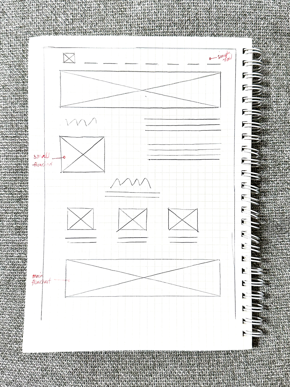
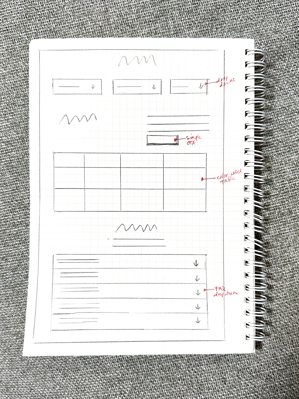

WIREFRAMING
I always start with old school sketching for wireframes. A one-page site that will condense some content in containers, and will be available when needed — like a bookshelf in a library. The design will use drop-downs to contain these texts as a way of simplifying the content.
I always start with old school sketching for wireframes. A one-page site that will condense some content in containers, and will be available when needed — like a bookshelf in a library. The design will use drop-downs to contain these texts as a way of simplifying the content.
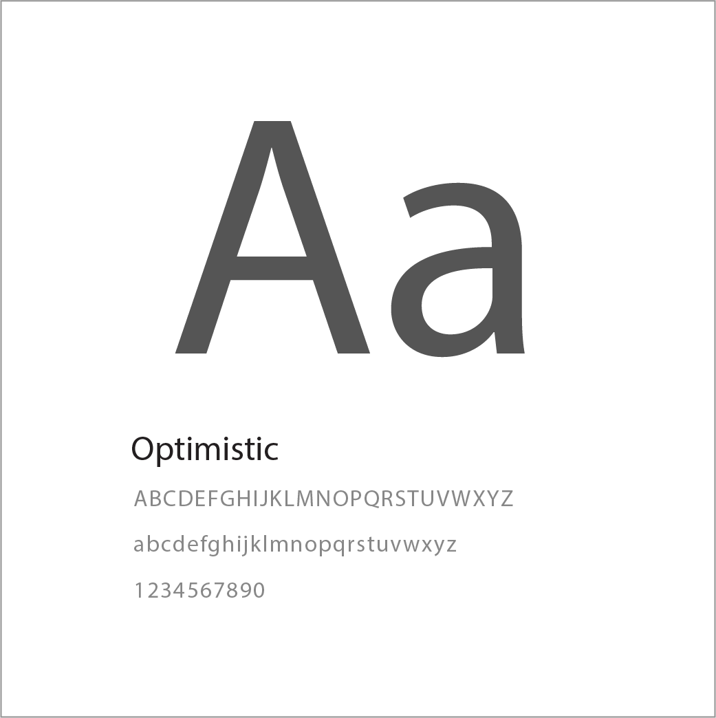
TYPOGRAPHY
As part of the company's branding guidelines, we are using Optimistic text which is a typeface exclusive to the company.
As part of the company's branding guidelines, we are using Optimistic text which is a typeface exclusive to the company.
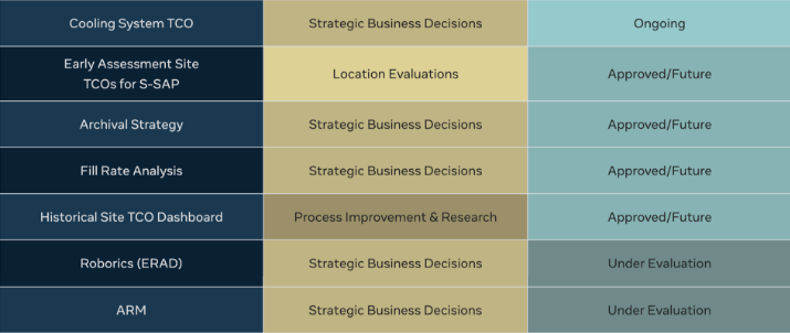
COLOR PALETTE
We used green as the accent color having in mind that the team is involve in finances, and a shade of blue and yellow to compliment that. Also adding other colors in varying shades of gray to add neutrality to the main colors.
We used green as the accent color having in mind that the team is involve in finances, and a shade of blue and yellow to compliment that. Also adding other colors in varying shades of gray to add neutrality to the main colors.


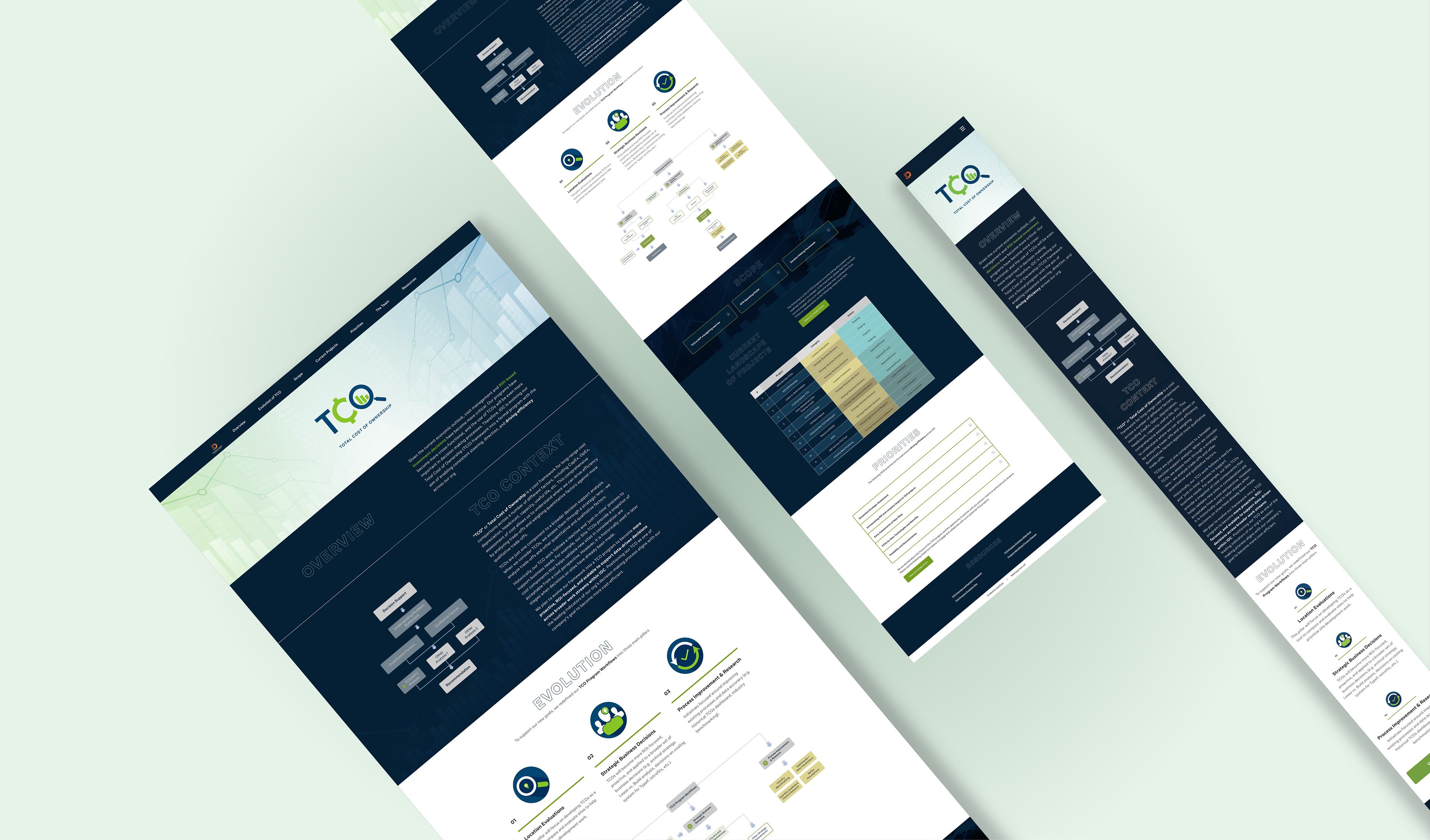
NAV BAR, DROPDOWNS AND COLOR CODING
These were some of the solutions to help the stakeholders organize their content and simplify the UI. One solution I designed was to put some text heavy sections in a container by the use of dropdowns, this will help users lessen the scrolling time and remove visual clutter by making the text more scannable. Color coding was also an idea to help users breakdown information instinctively, so improving readability. The nav bar are also linked to each section to improve the user experience in navigating throughout the page.
These were some of the solutions to help the stakeholders organize their content and simplify the UI. One solution I designed was to put some text heavy sections in a container by the use of dropdowns, this will help users lessen the scrolling time and remove visual clutter by making the text more scannable. Color coding was also an idea to help users breakdown information instinctively, so improving readability. The nav bar are also linked to each section to improve the user experience in navigating throughout the page.

Prototype
USER FLOW
The flow of this page is very simple. Users will instantly have access to the section they are looking for using the nav bar. As they go through the page, they will find the content designed in a way that simplifies the UI using drop-downs and color coding.
The flow of this page is very simple. Users will instantly have access to the section they are looking for using the nav bar. As they go through the page, they will find the content designed in a way that simplifies the UI using drop-downs and color coding.
ONE HAPPY STAKEHOLDER :)
This was the third time I worked with the stakeholder, and after publishing the design for testing, we got a lot of good feedback from users, giving compliments on how easy the navigation was and how organized everything was. This project demonstrates how purely visual design changes can have a significant impact on the user experience of a homepage.
This was the third time I worked with the stakeholder, and after publishing the design for testing, we got a lot of good feedback from users, giving compliments on how easy the navigation was and how organized everything was. This project demonstrates how purely visual design changes can have a significant impact on the user experience of a homepage.